I help shape campaigns and build systems that power the ideas behind them. To me, a design system isn’t just a way to organize assets, it’s a strategic tool that solves brand challenges and expresses messaging with intelligence and purpose. The best systems are thoughtful and flexible, built to scale without losing their soul. They give cross-functional teams a solid foundation while leaving room for creativity, emotion, and human connection. That’s the kind of work I love to lead.

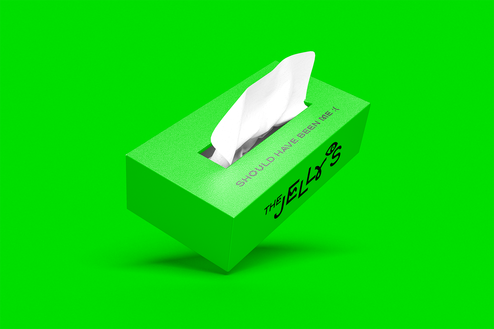
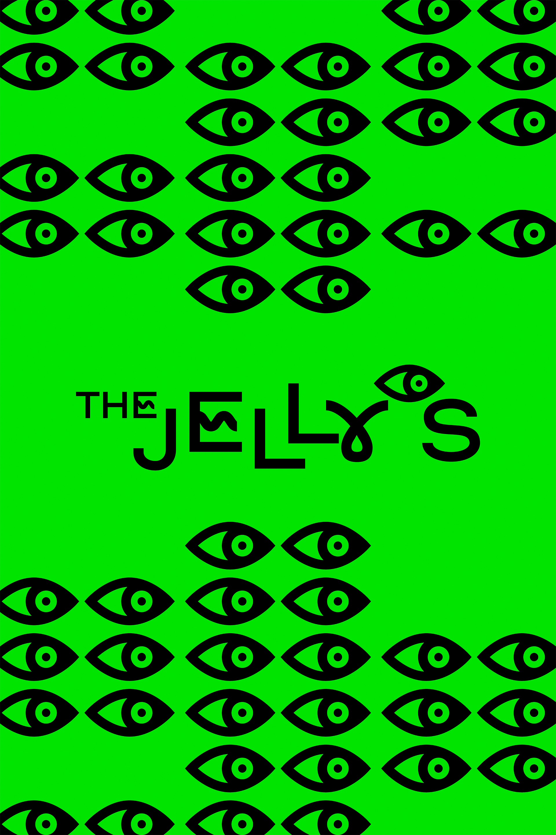
HAVAS NEW YORK - THE JELLY’S
”SIDE EYE ACTION”
Design Direction / Art Direction
As Head of Design & Art Direction at Havas New York, I create design systems for internal events. The Jelly’s, our post-Cannes Lions celebration, is one of my favorites. The event celebrates winning work while inspiring attendees to create their own, thriving on participation and interaction. The visual concept plays on envy, the classic side-eye and a green palette nod to jealousy, resulting in a bold, playful design system that mirrors the event’s lively, irreverent energy.



MATTRESS FIRM
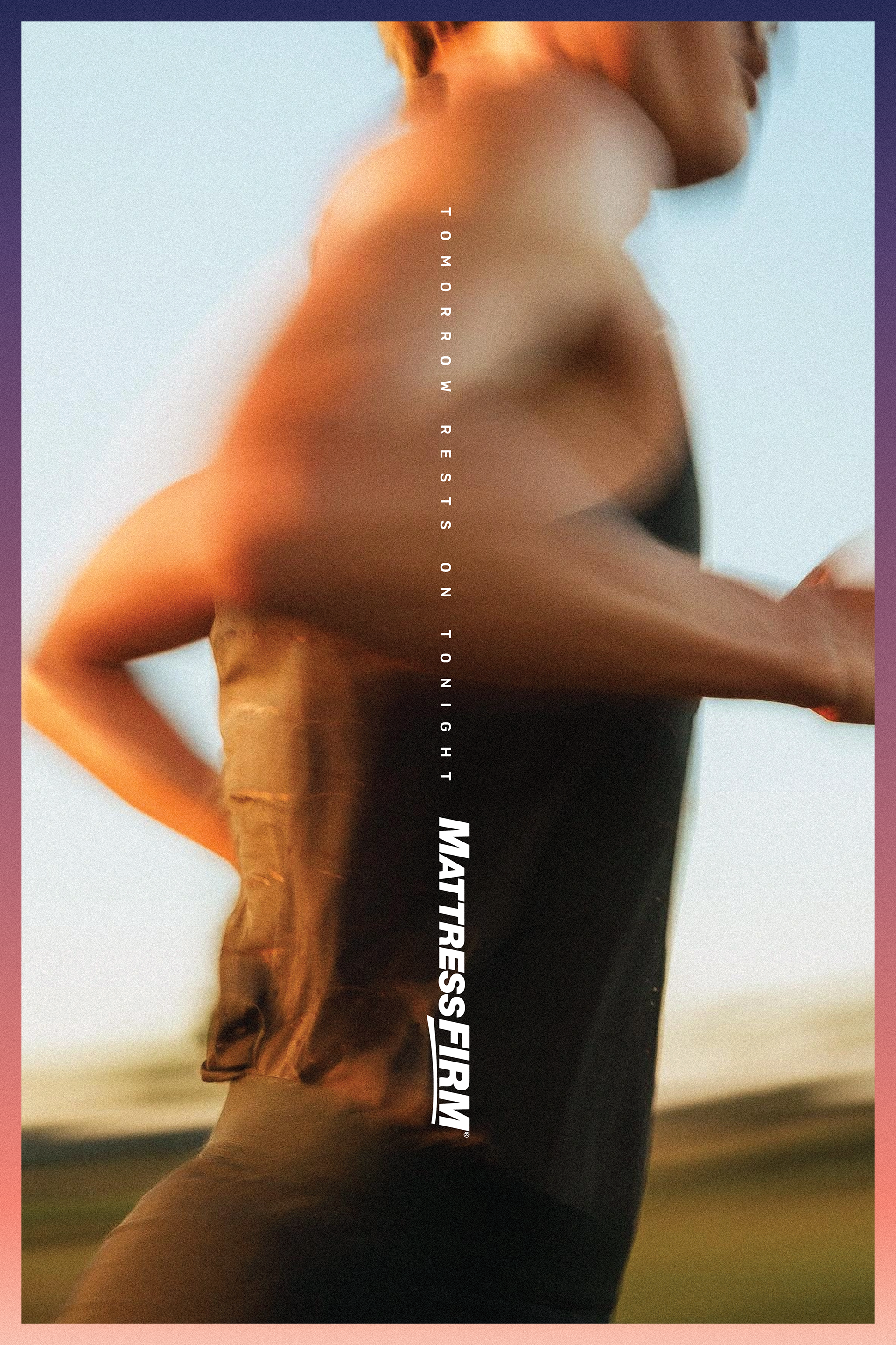
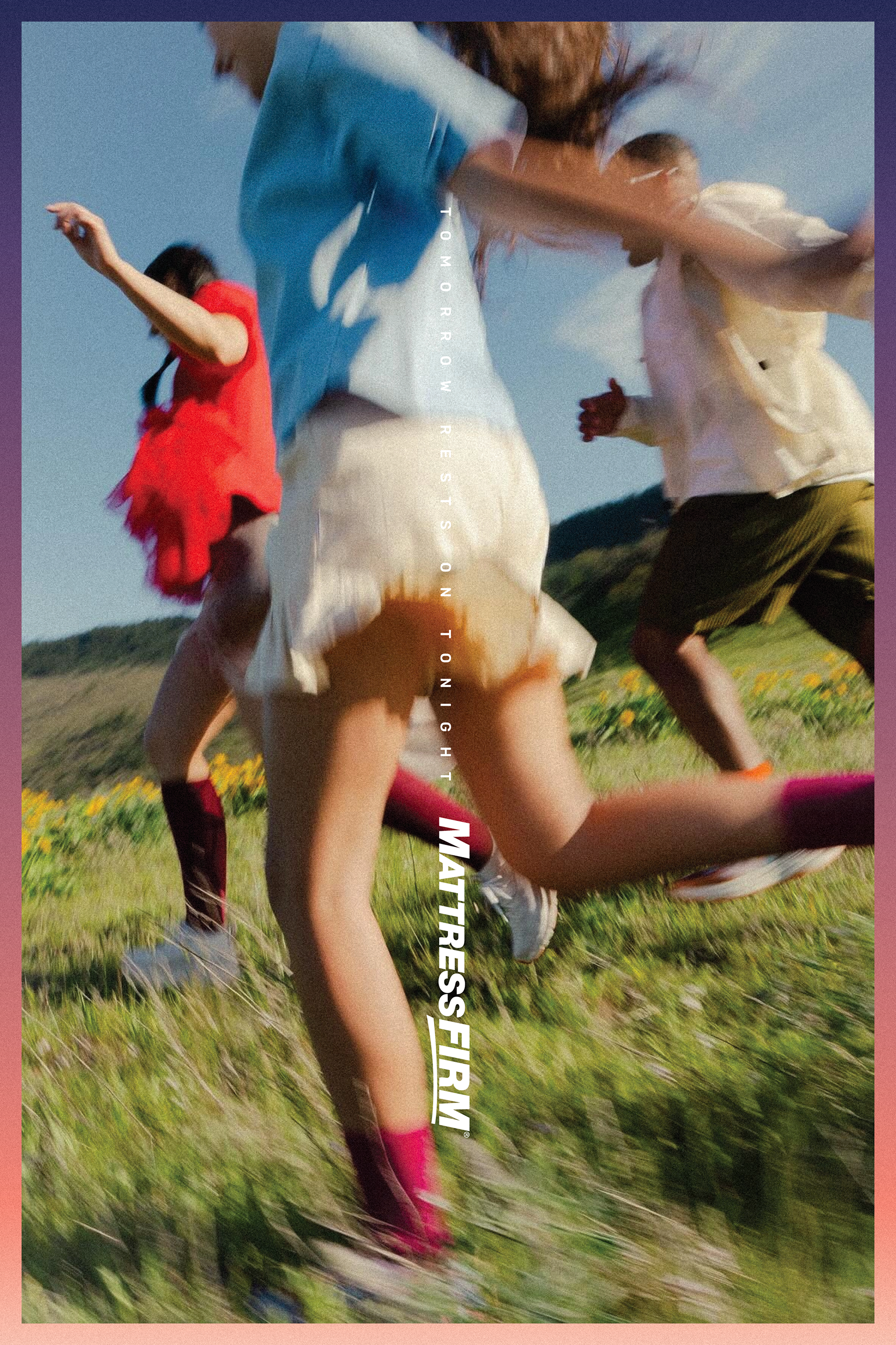
”DAYBREAK GRADIENT”
Design Direction / Art Direction
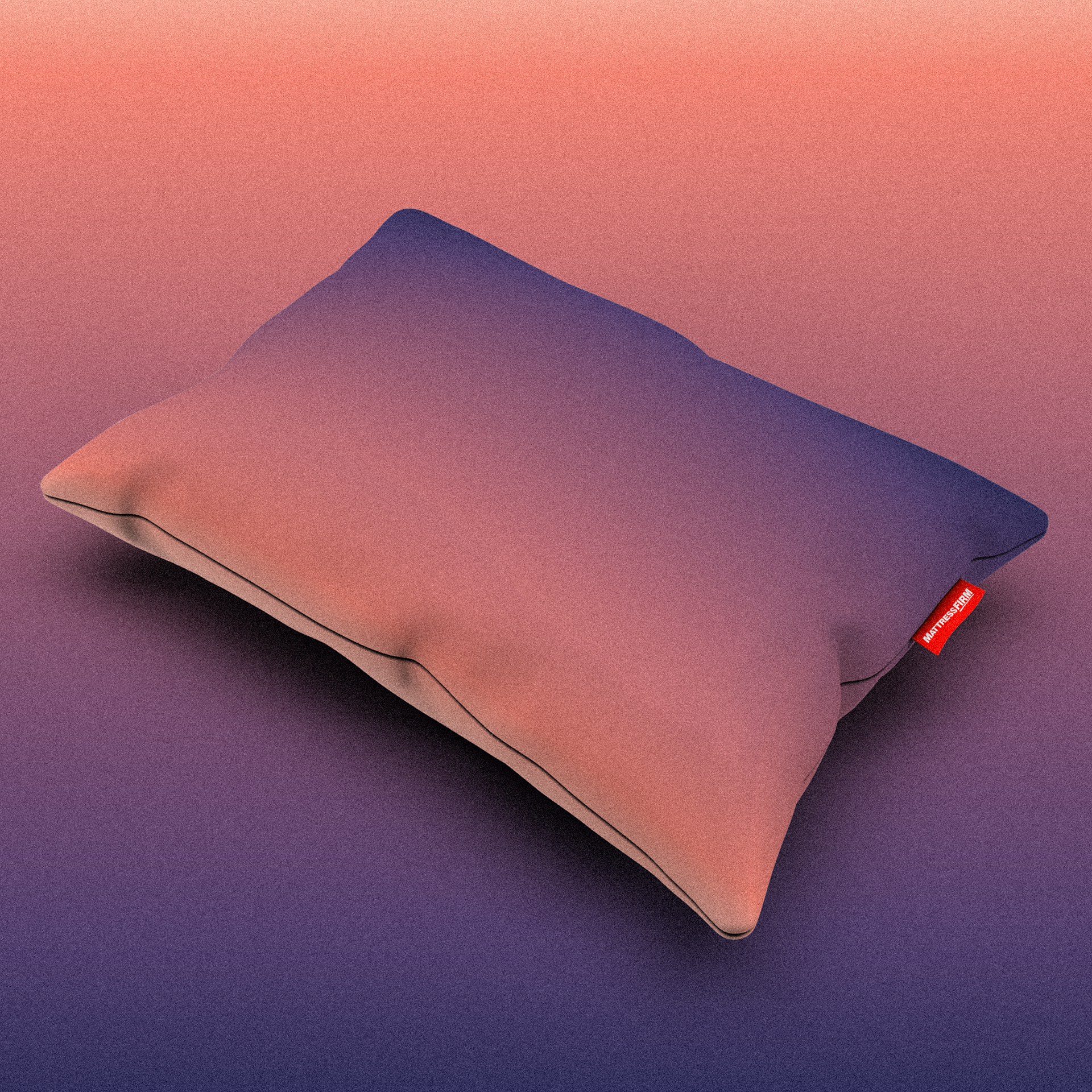
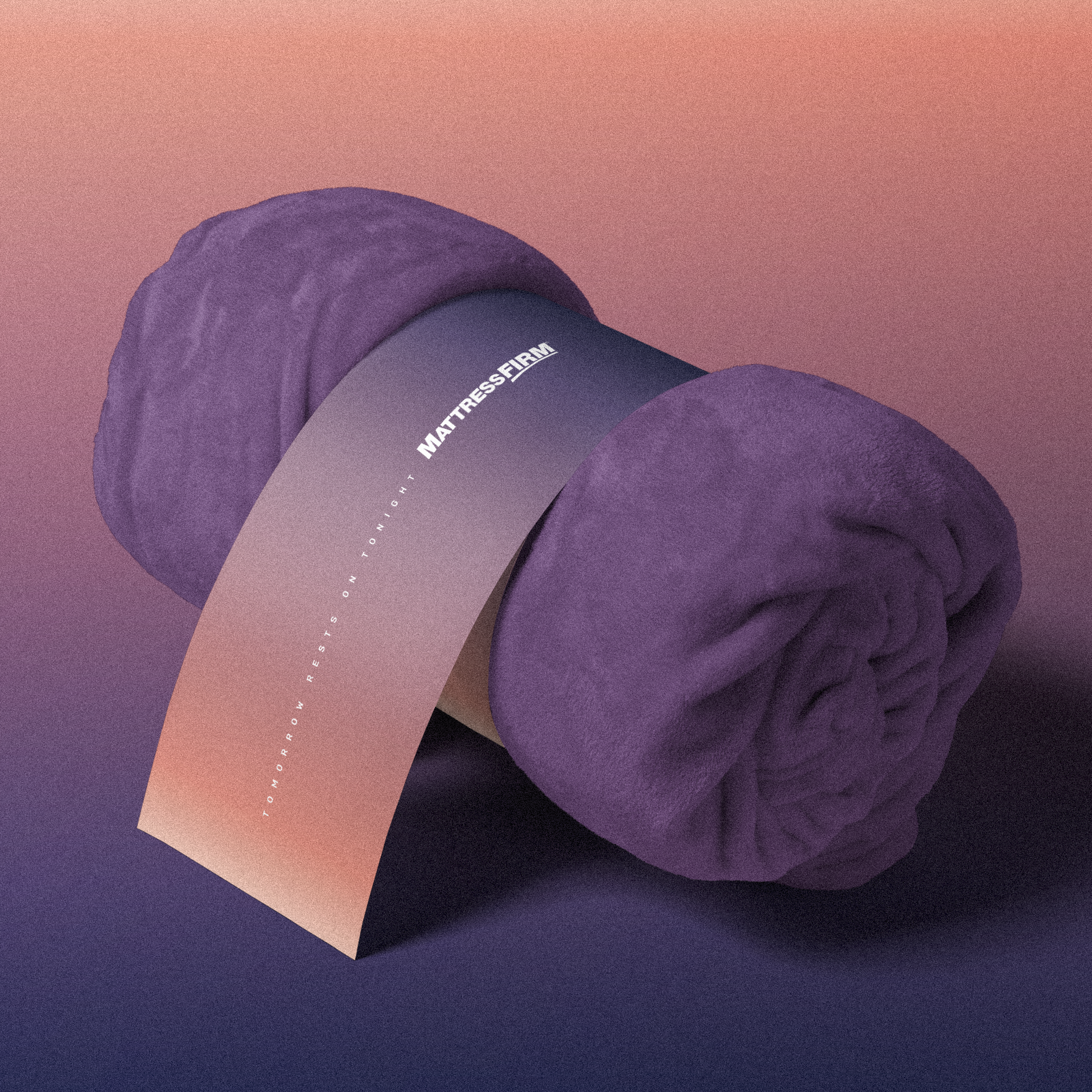
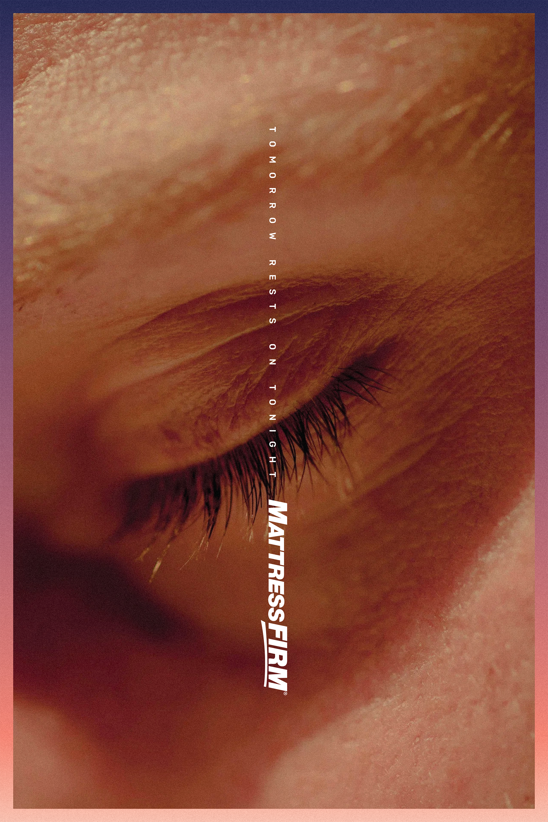
Uninterrupted sleep is a rare luxury, one that calms the mind and eases the body. Our gradients capture the quiet transition from night to sunrise, reflecting that fleeting moment of stillness before the day begins. Grounded in Mattress Firm’s palette, the result feels effortless, as if it has always been there.





BENJAMIN MOORE
”ICON”
Design Direction / Art Direction
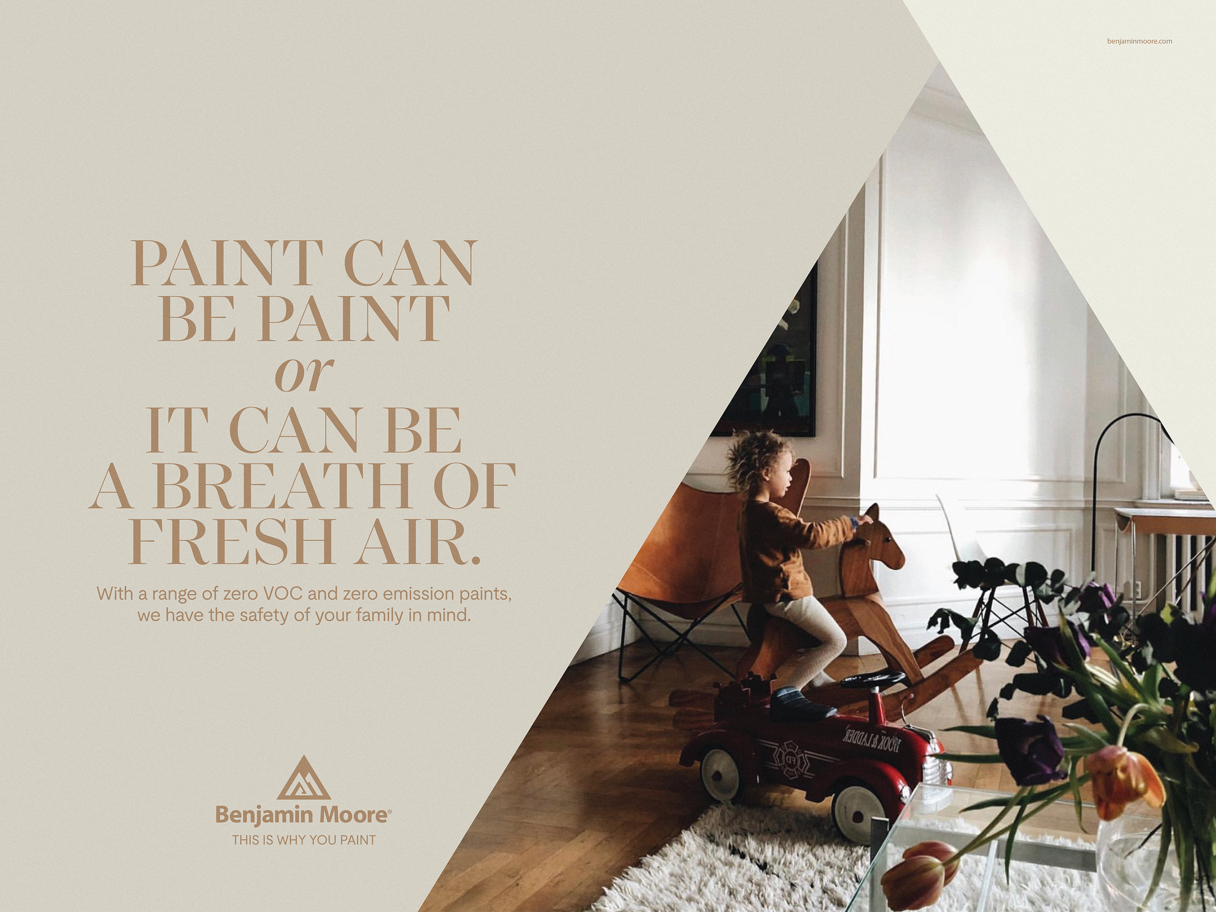
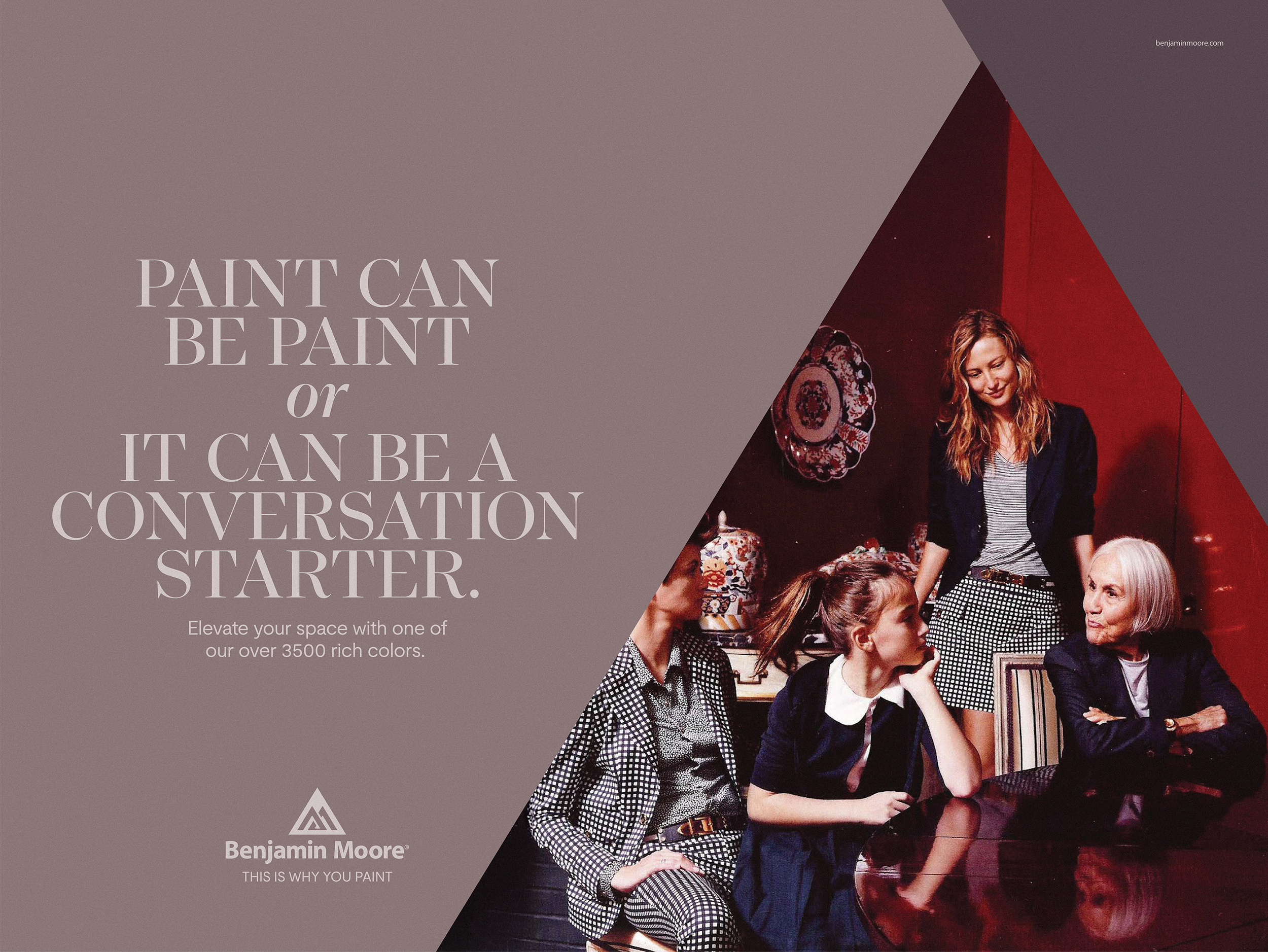
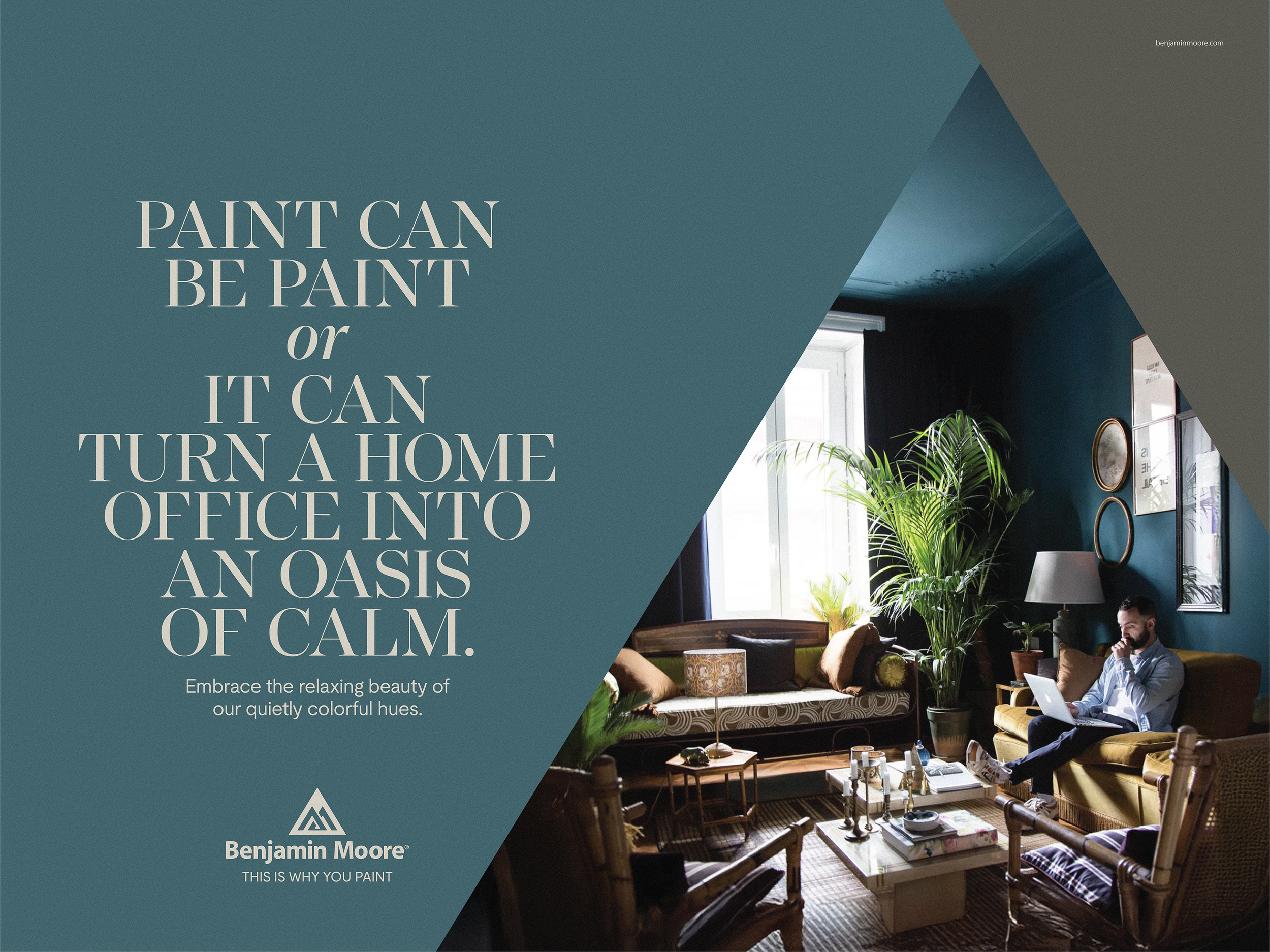
Benjamin Moore wanted to elevate their visual presence while preserving decades of brand recognition. We started with their existing logomark, using its familiar shape as the foundation for a flexible, contemporary design system. By expanding on the core geometry, the identity evolves without losing its heritage. The result is a system that feels refreshed, not reinvented.

SHAKE SHACK
”LOVE YOU MORE HEARTBEAT”
Design Direction / Art Direction
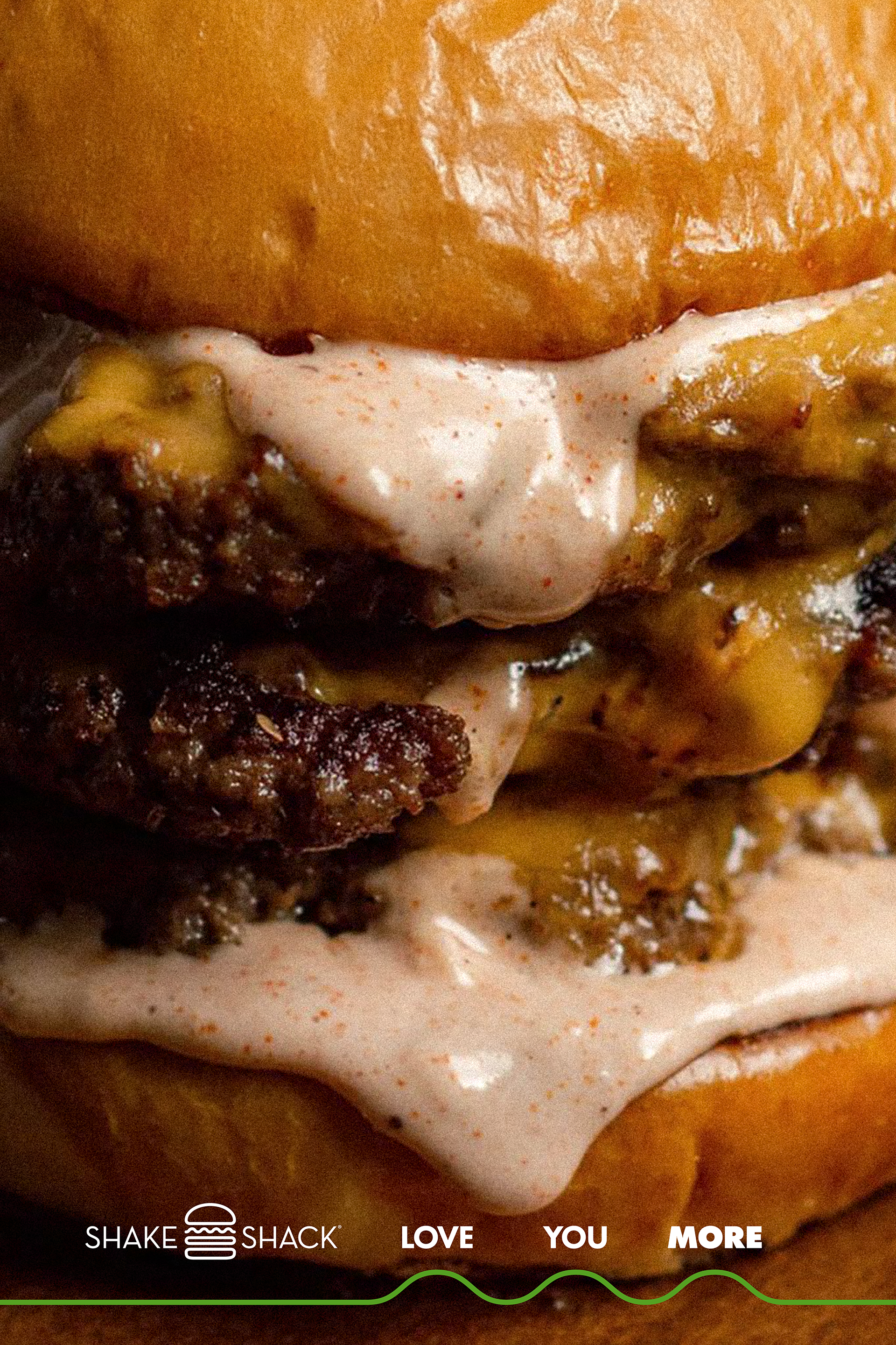
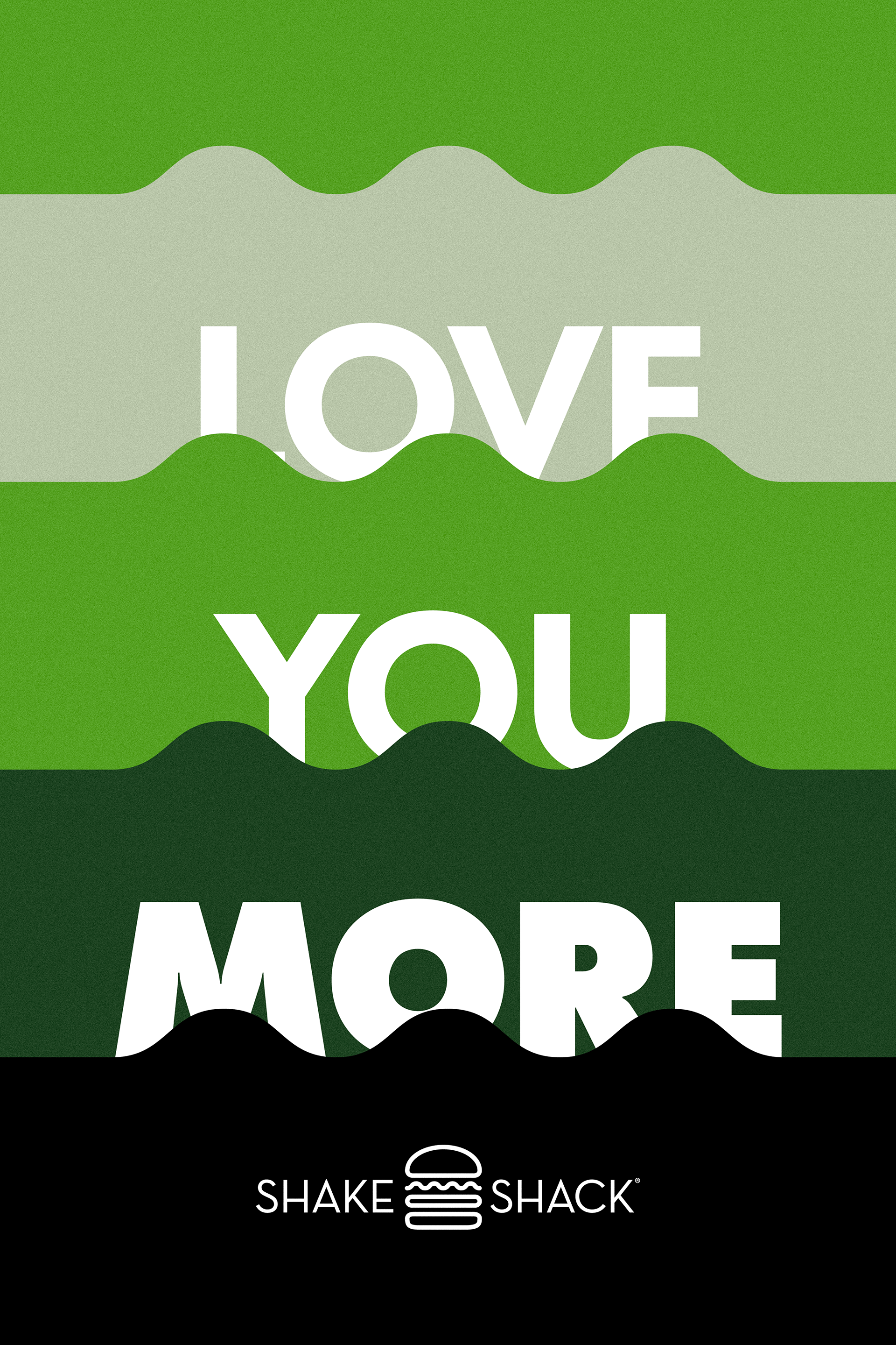
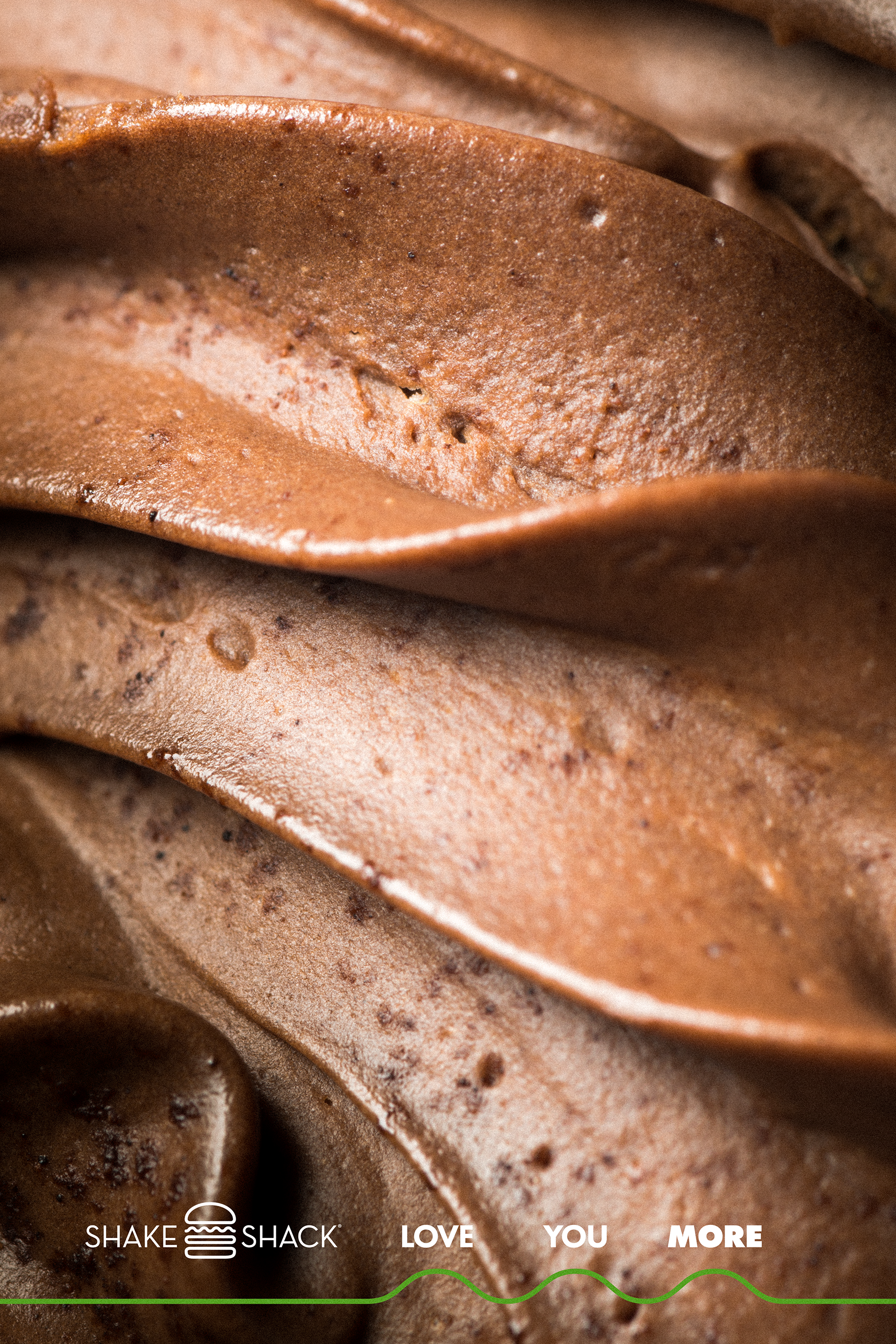
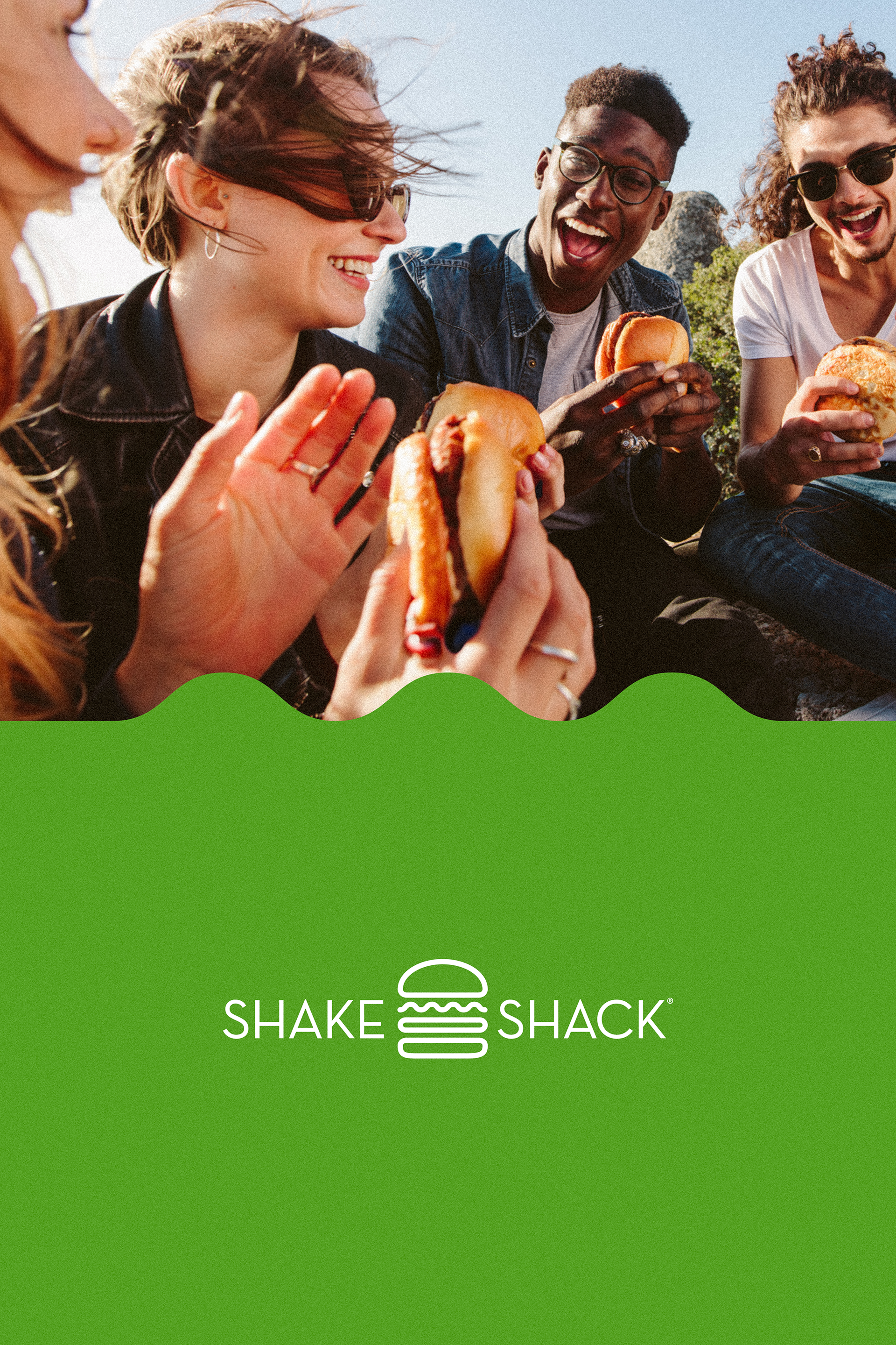
This system reimagines the curly flourish from the Shake Shack icon as a graphic heartbeat, a nod to the Love You More campaign. It honors the brand’s heritage while introducing a modular, flexible structure. With mix-and-match components, the system allows endless layout possibilities, offering consistency without sacrificing creativity. The result balances heart, heritage, and modern expression.


STRAYER UNIVERSITY
”PILLARS OF EXCELLENCE”
Design Direction / Art Direction
We transformed the pillar in Strayer University’s logo from a structural motif into a symbol of ambition and resilience. Rising upward, it became a visual metaphor for the pursuit of excellence and the drive to go further.

HEAVEN HILL
”LIVE BY IT GRID”
Design Direction / Art Direction
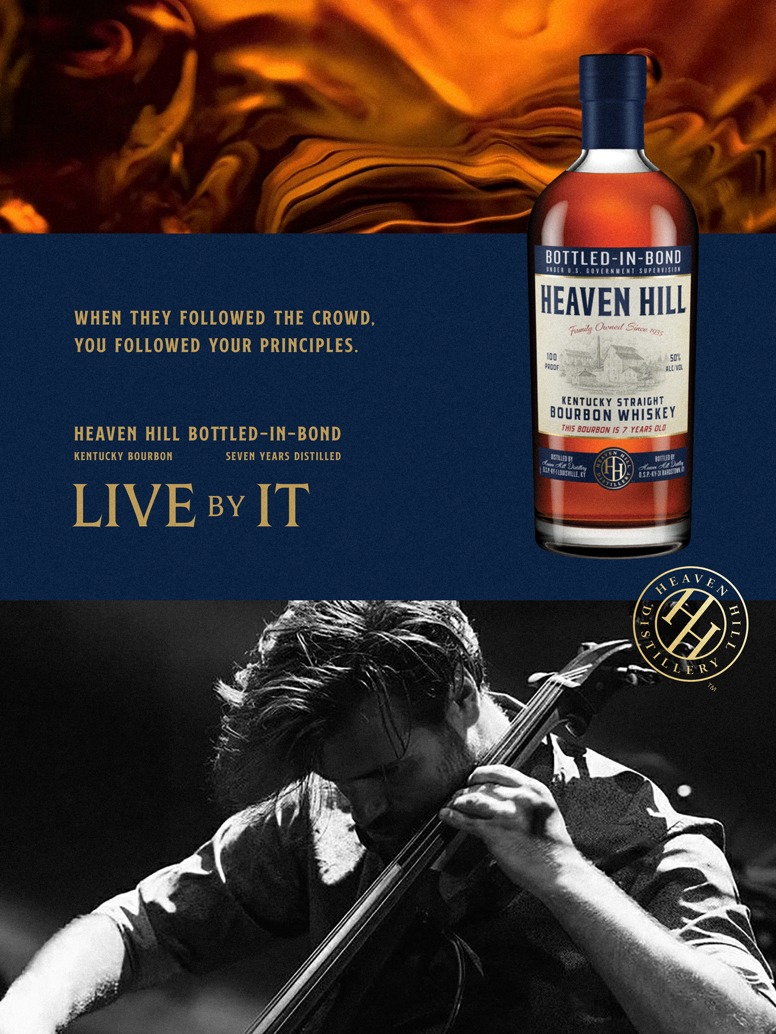
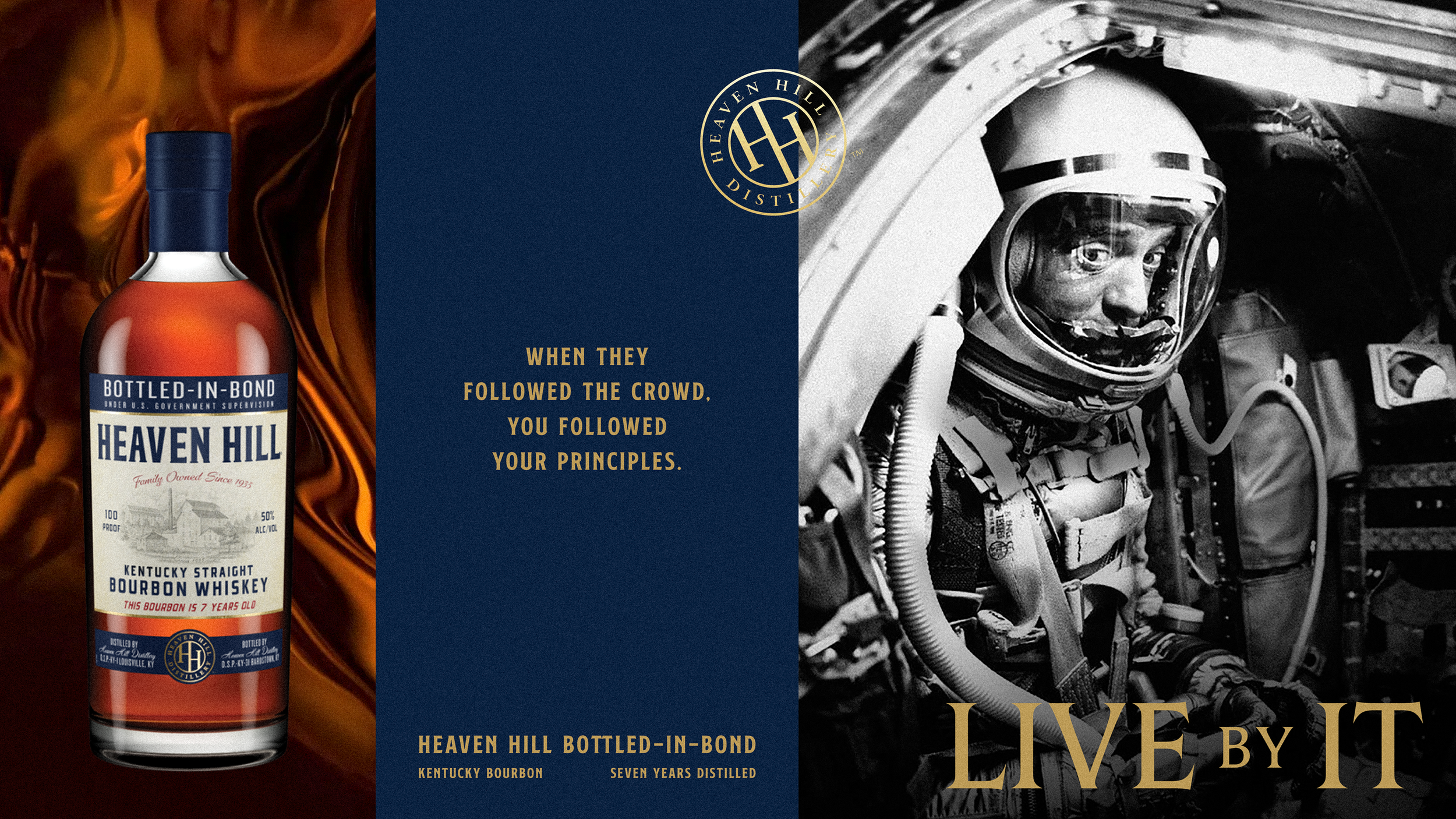
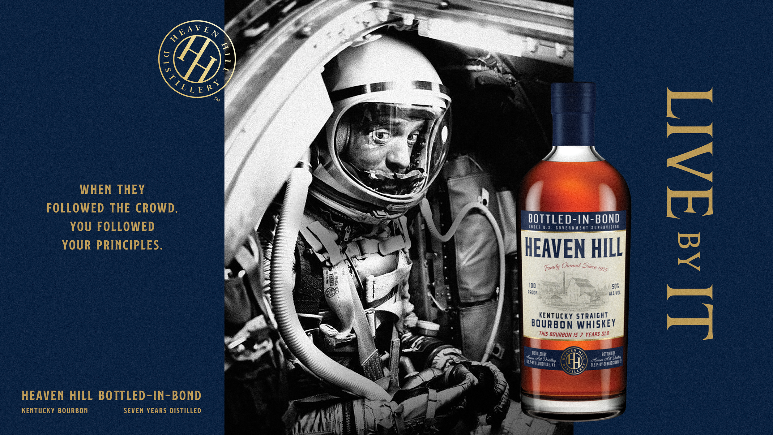
When Heaven Hill aimed to become the next great American brand, we designed a bold, modular system inspired by the soul of their product, the bottle label. Anchored in a strong grid and brought to life with striking black-and-white photography, the system honors heritage while paving the way forward. The result is an iconic visual language that feels as timeless as a fine bourbon, smooth, confident, and unmistakable.


WELLS FARGO
”OPTIMISTIC BLOOM”
Design Direction / Art Direction
We reimagined the Wells Fargo square as more than a structural motif, it became a symbol of growth, a space where ideas, ambitions, and opportunities can thrive.
This guided the creation of a flexible design system that feels energetic, modern, and inviting, while remaining rooted in the brand’s legacy. Built to evolve with the people it serves, the system brings a renewed sense of optimism and forward momentum.

