I started in advertising, crafting ideas built to stand out. Over time, I became more drawn to what holds a brand together, the structure, the systems, the design thinking behind the message. That pull led me from campaigns to brand design, where clarity, consistency, and meaning live. If you’re curious about that approach, you’ll find more of it in the next section.


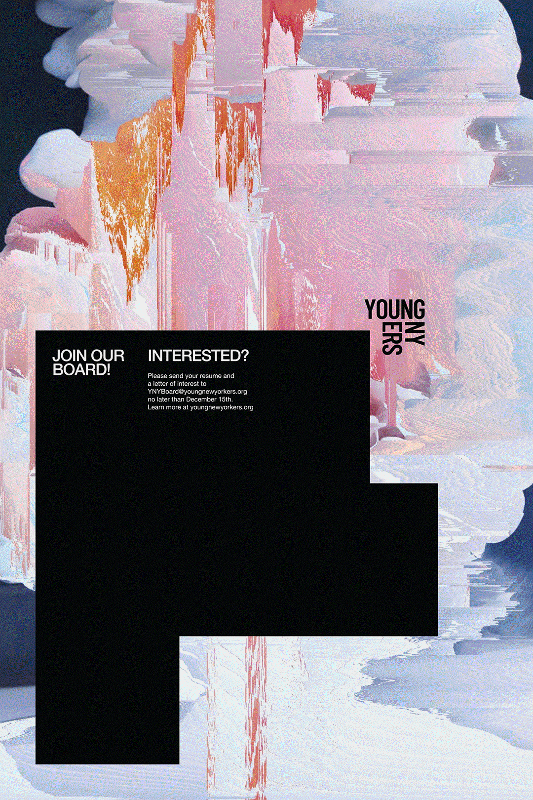

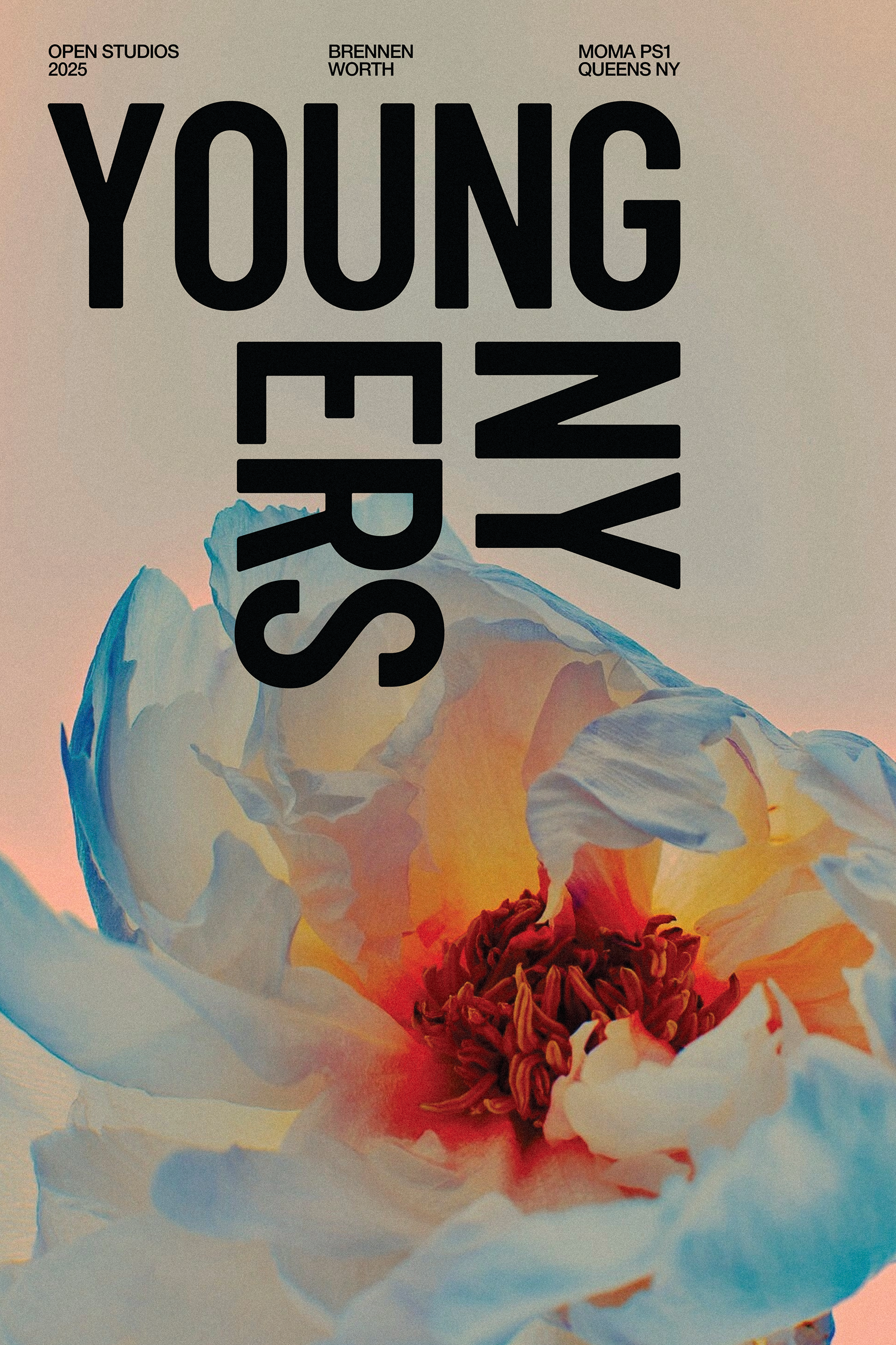
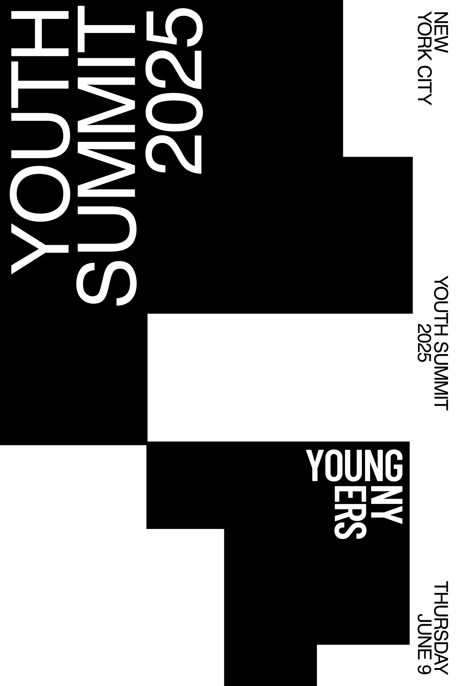
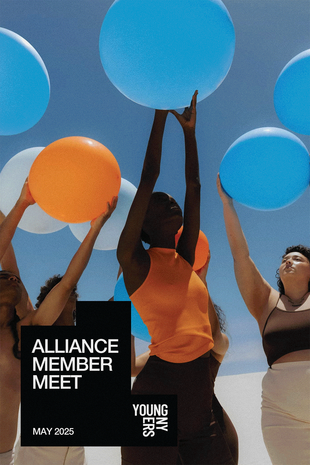
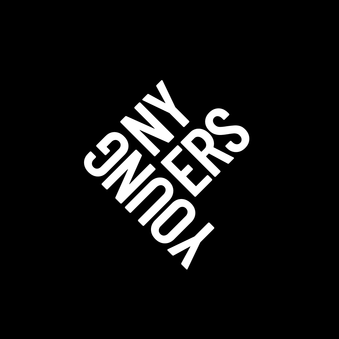
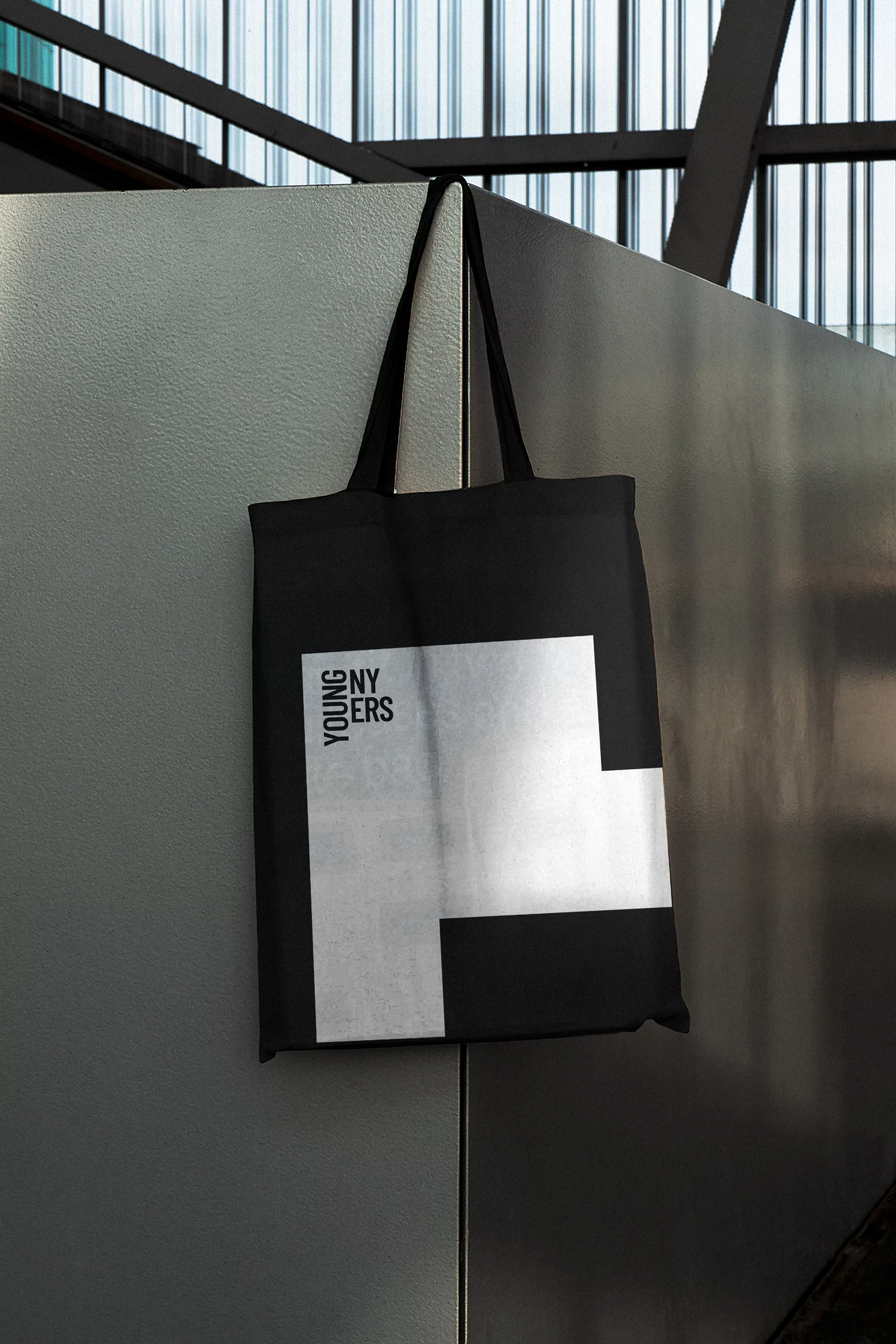
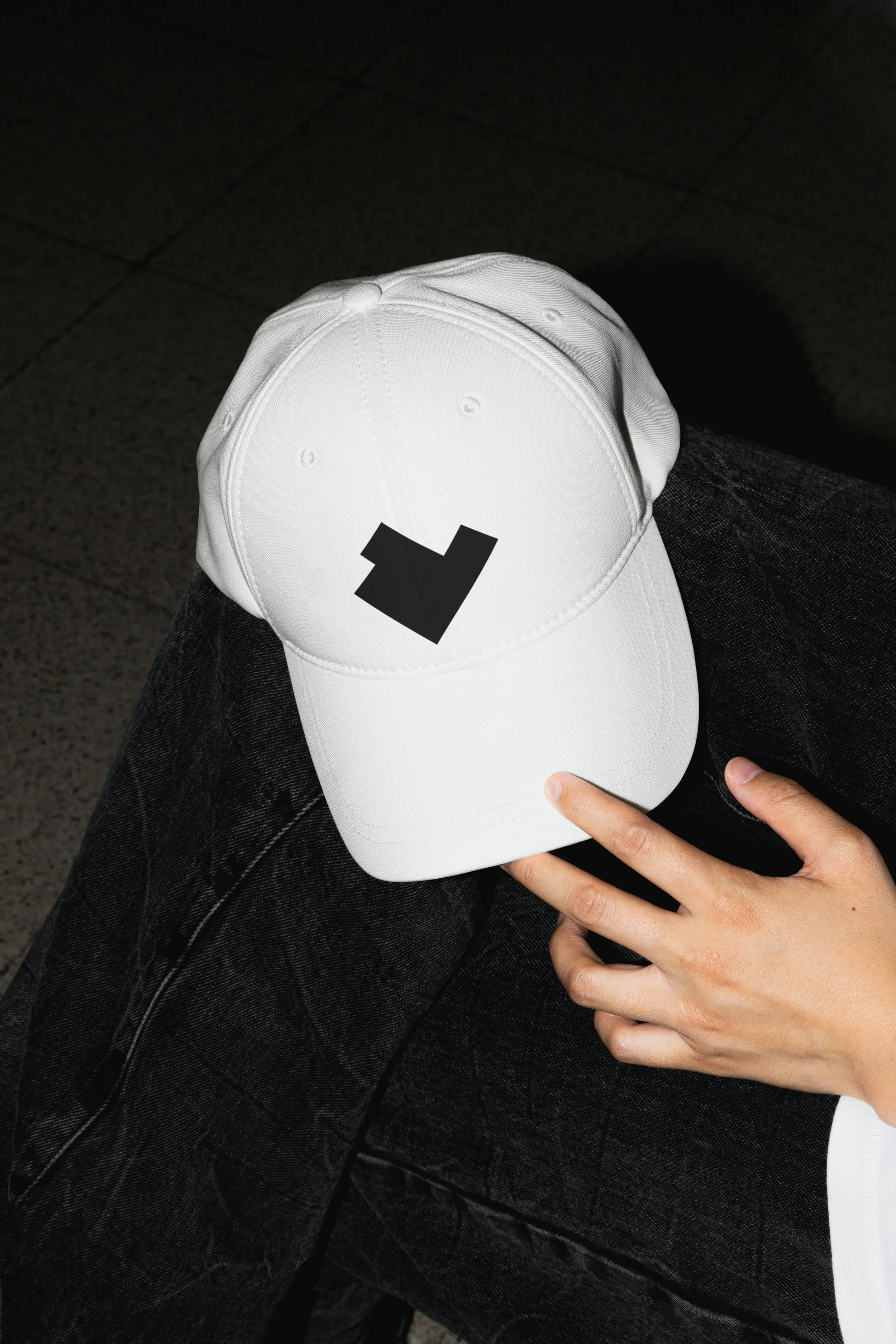
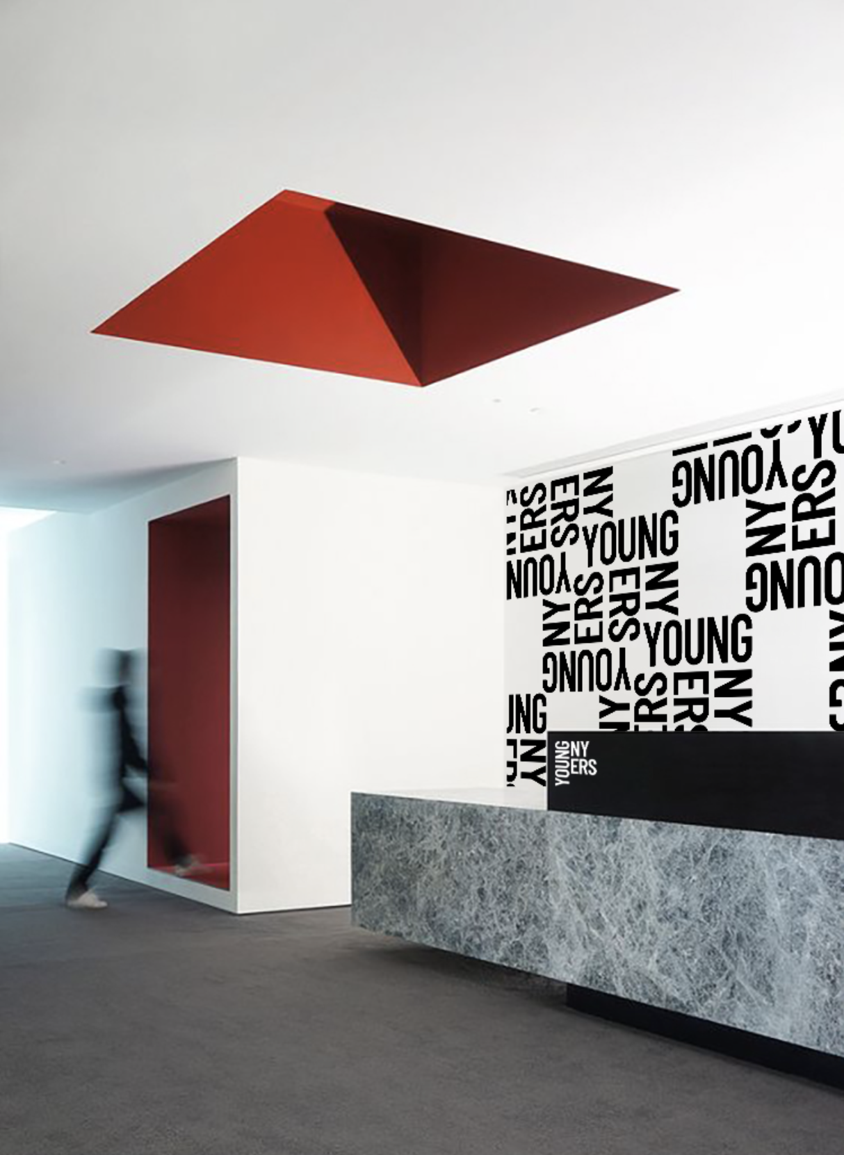
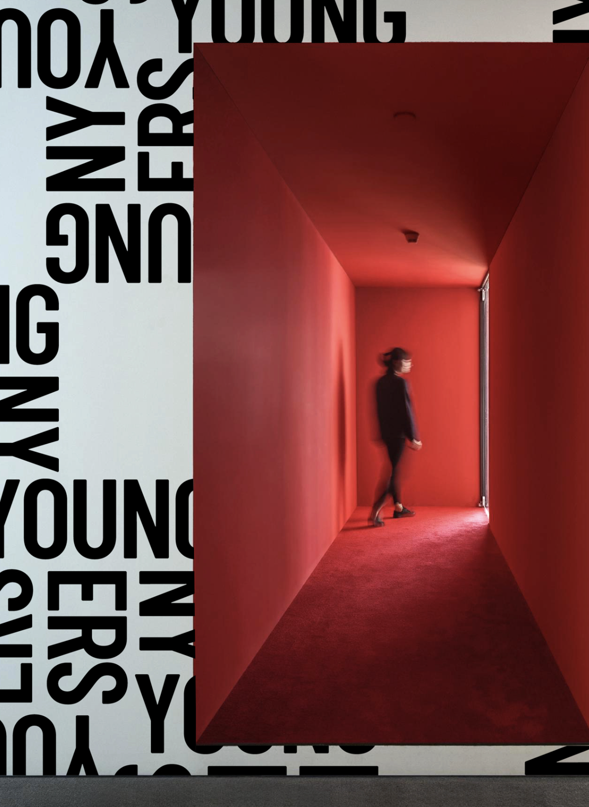
YOUNG NEW YORKERS
”CATALYST OF CHANGE”
Creative Direction / Design Direction
Young New Yorkers is a nonprofit that helps young people move beyond the criminal legal system through restorative, art-based diversion programs. Their mission reframes justice, not as punishment, but as possibility.
The idea of “Redirecting Futures” sits at the core of the identity. The logo’s corners act as anchor points, a metaphor for moments of redirection and transformation. From that form, a distinctive and flexible design system emerged, built to express change, progress, and hope.

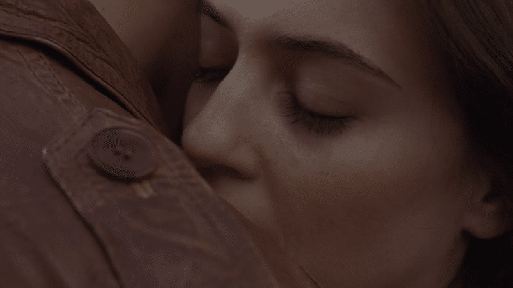
AIRTEL
”ENDLESS GOODBYE”
Creative Direction / Art Direction
I moved to Delhi to work on Airtel, spending three months apart from my then-girlfriend. Our connection survived through late-night calls and early-morning check-ins.
When the brief arrived to promote Airtel’s new 3G calling feature, it felt personal. We translated our own experience into the campaign: the ache of distance, the intimacy of a voice, and how staying connected makes goodbyes easier.
The film resonated because it was real, a simple story of love, technology, and the moments that carry us through.
P.S. We’re married now, with a little boy who loves hearing this story.
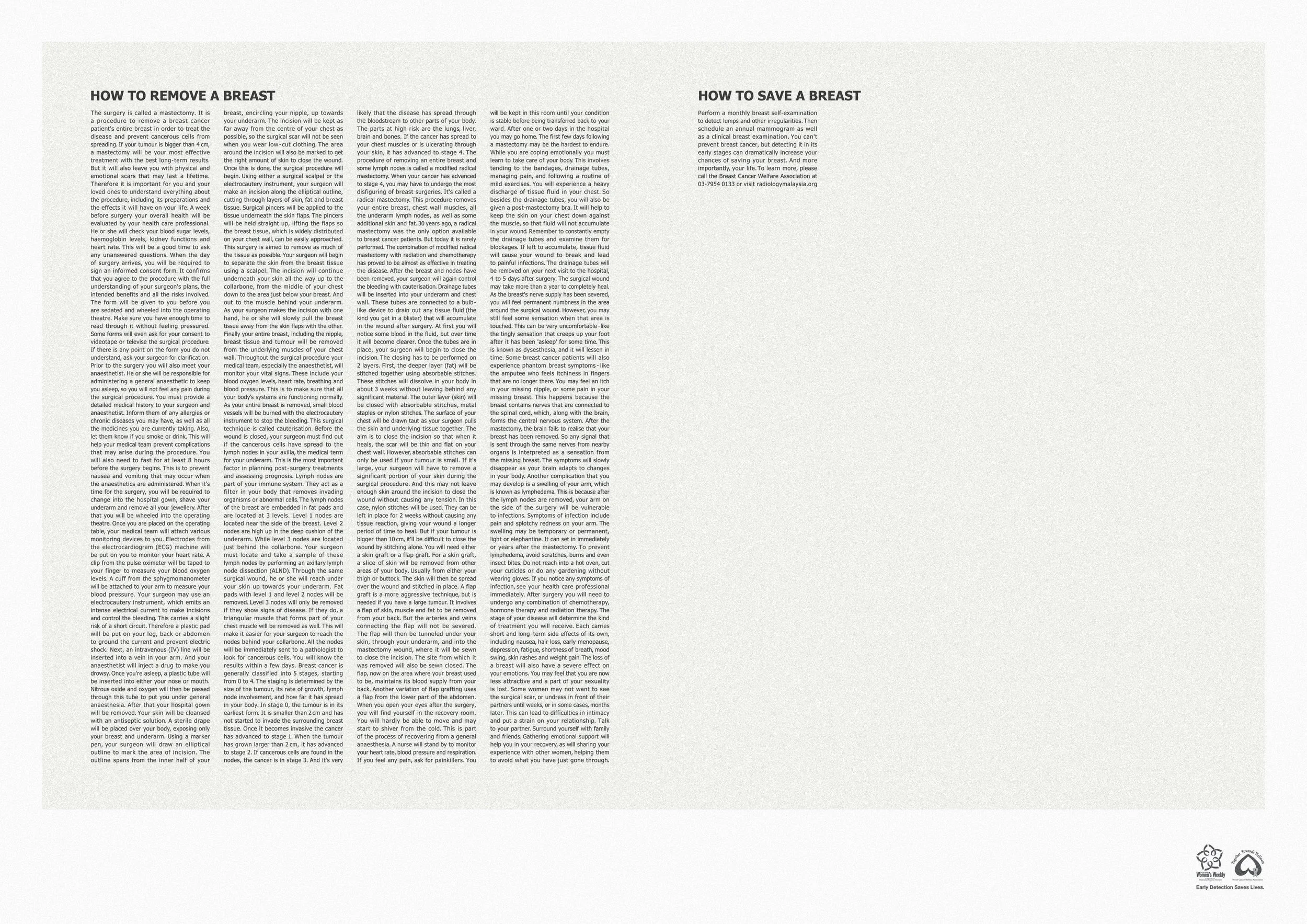
BREAST CANCER WELFARE ASSOCIATION
”HOW TO REMOVE”

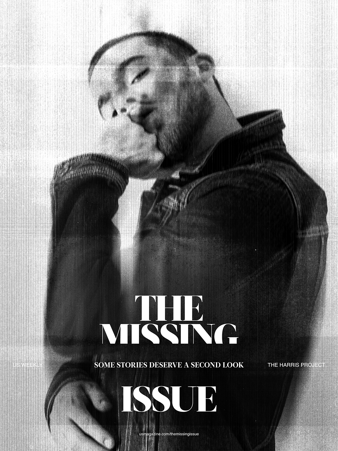
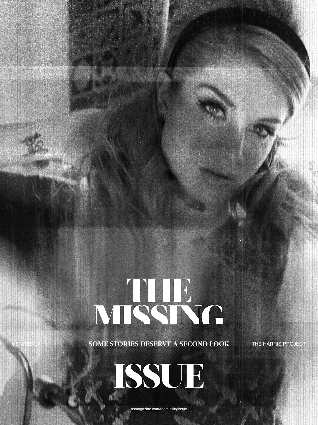
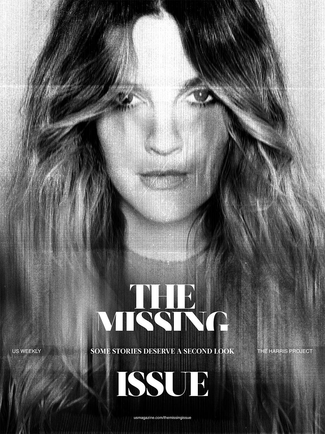
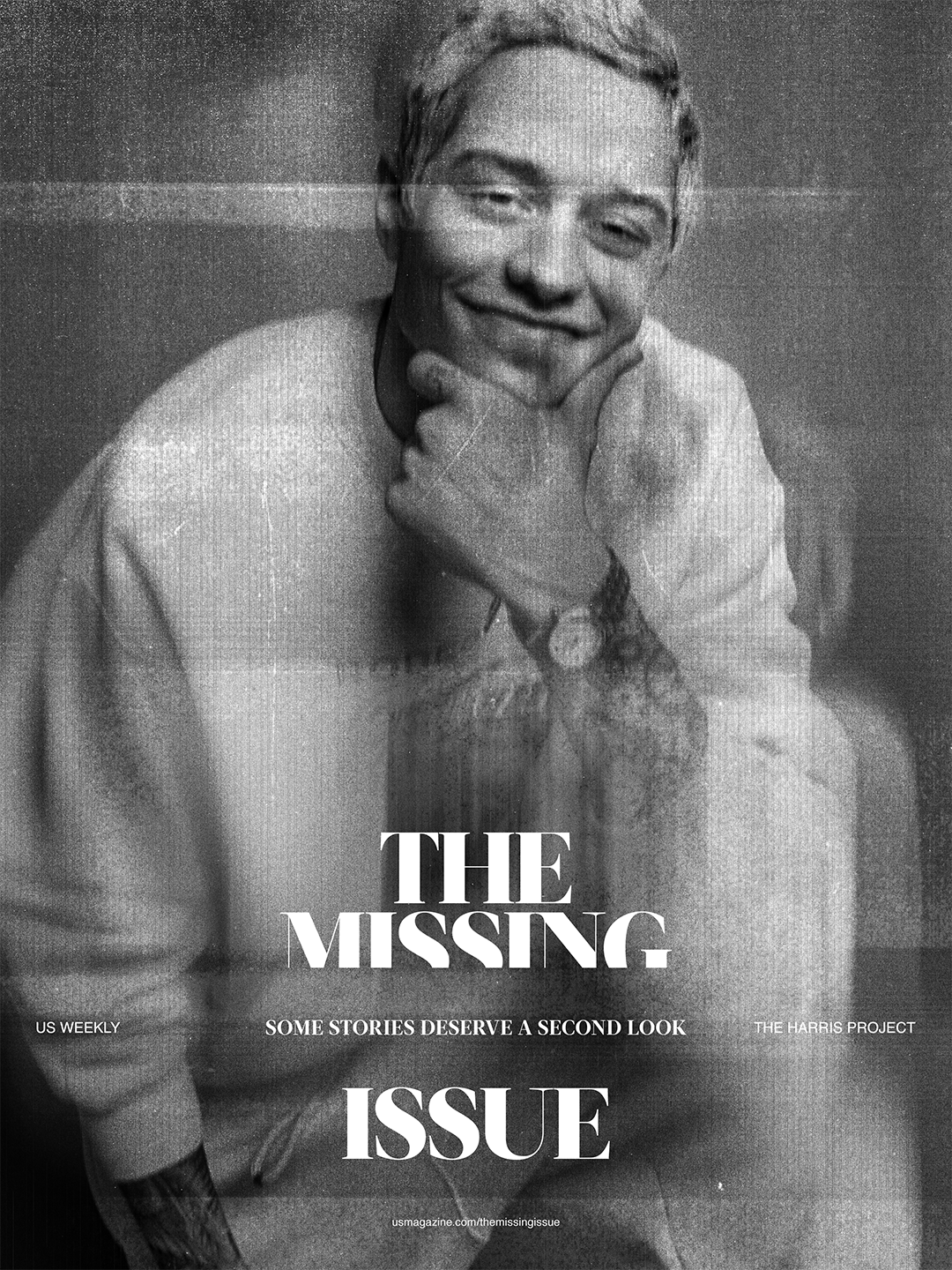
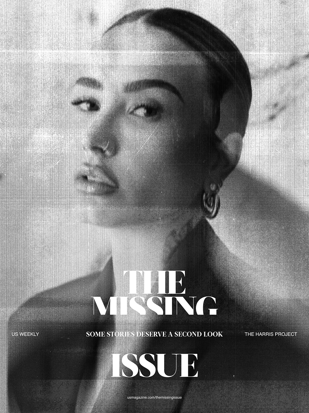
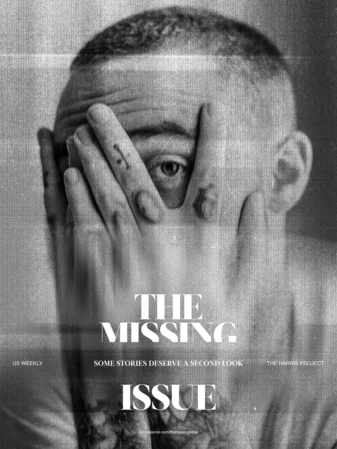
US WEEKLY X THE HARRIS PROJECT
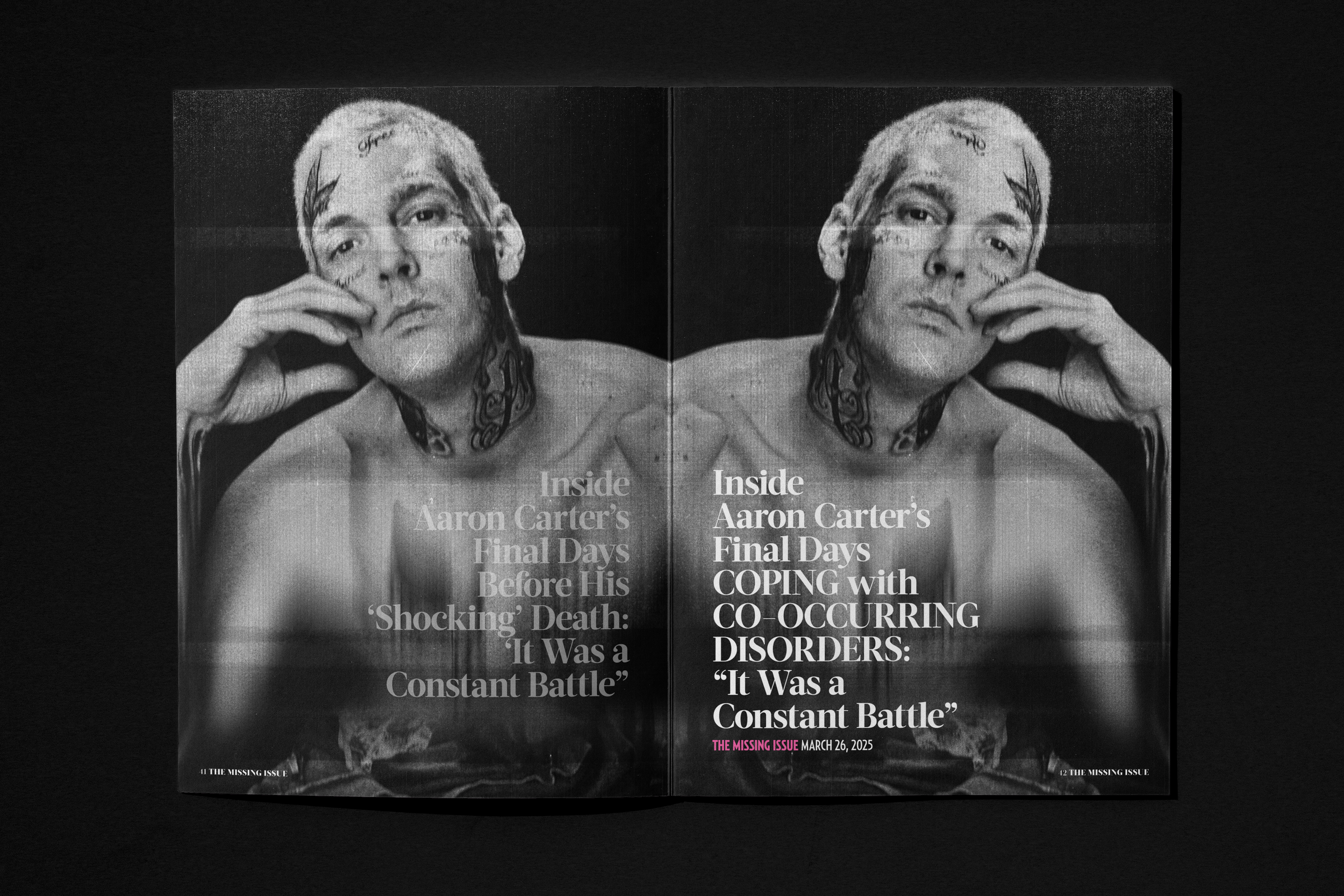
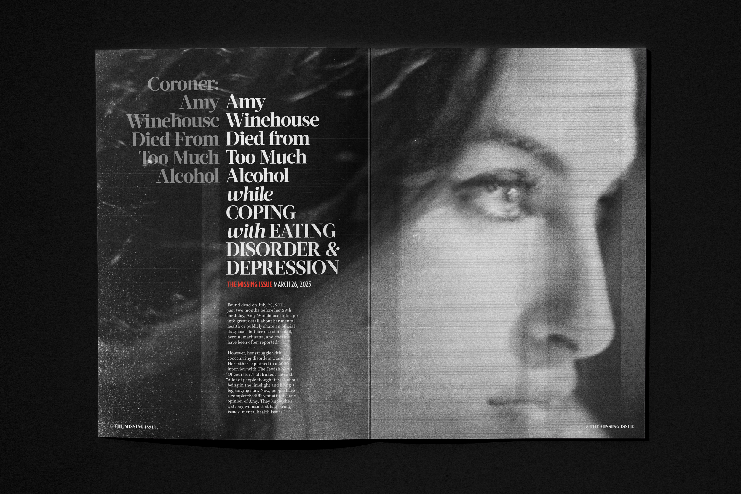
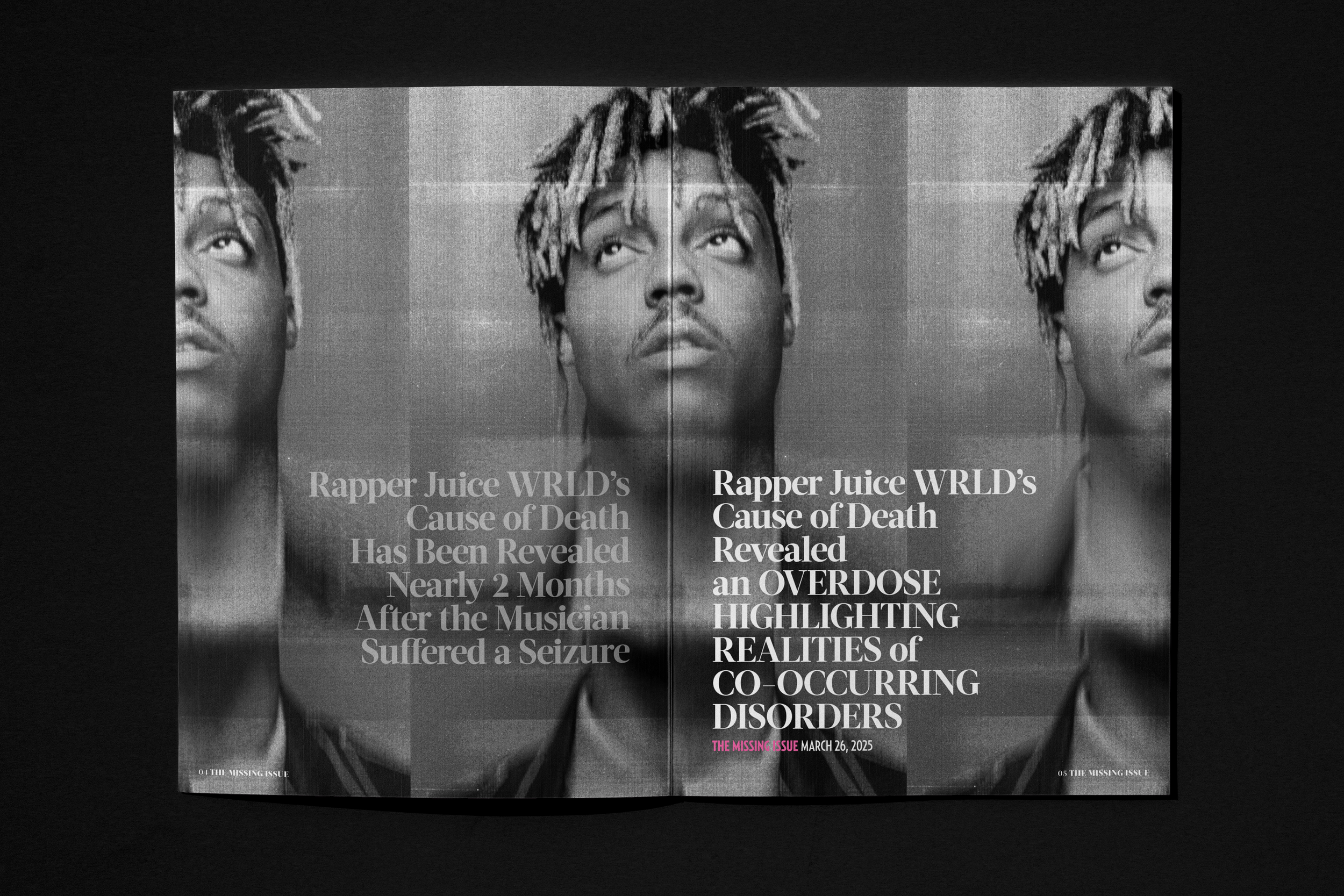
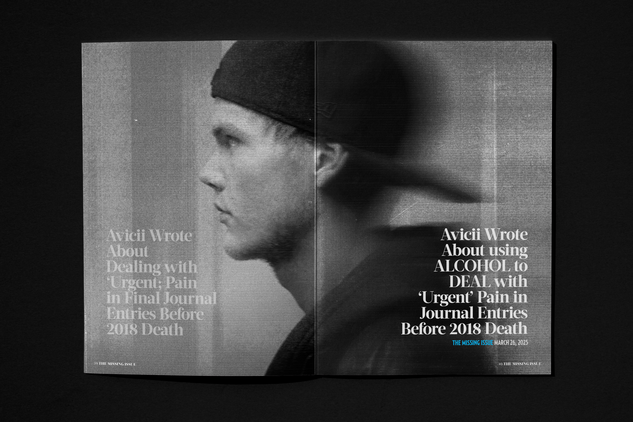
”THE MISSING ISSUE”
Design Direction / Art Direction
To challenge stigma around substance misuse, Us Weekly partnered with The Harris Project to reframe celebrity gossip through a lens that highlights the often-overlooked connection between substance use and mental health.
I led the design system, working closely with Us Weekly’s editorial teams across print and digital to create a seamless, intentional campaign. We revisited real headlines and stories, rewriting them with empathy and clinical insight to show the human experience behind the scandal.
The campaign spanned a special-edition print issue, digital features, and social platforms, sparking nationwide conversations about compassion, context, and the way stories are told.


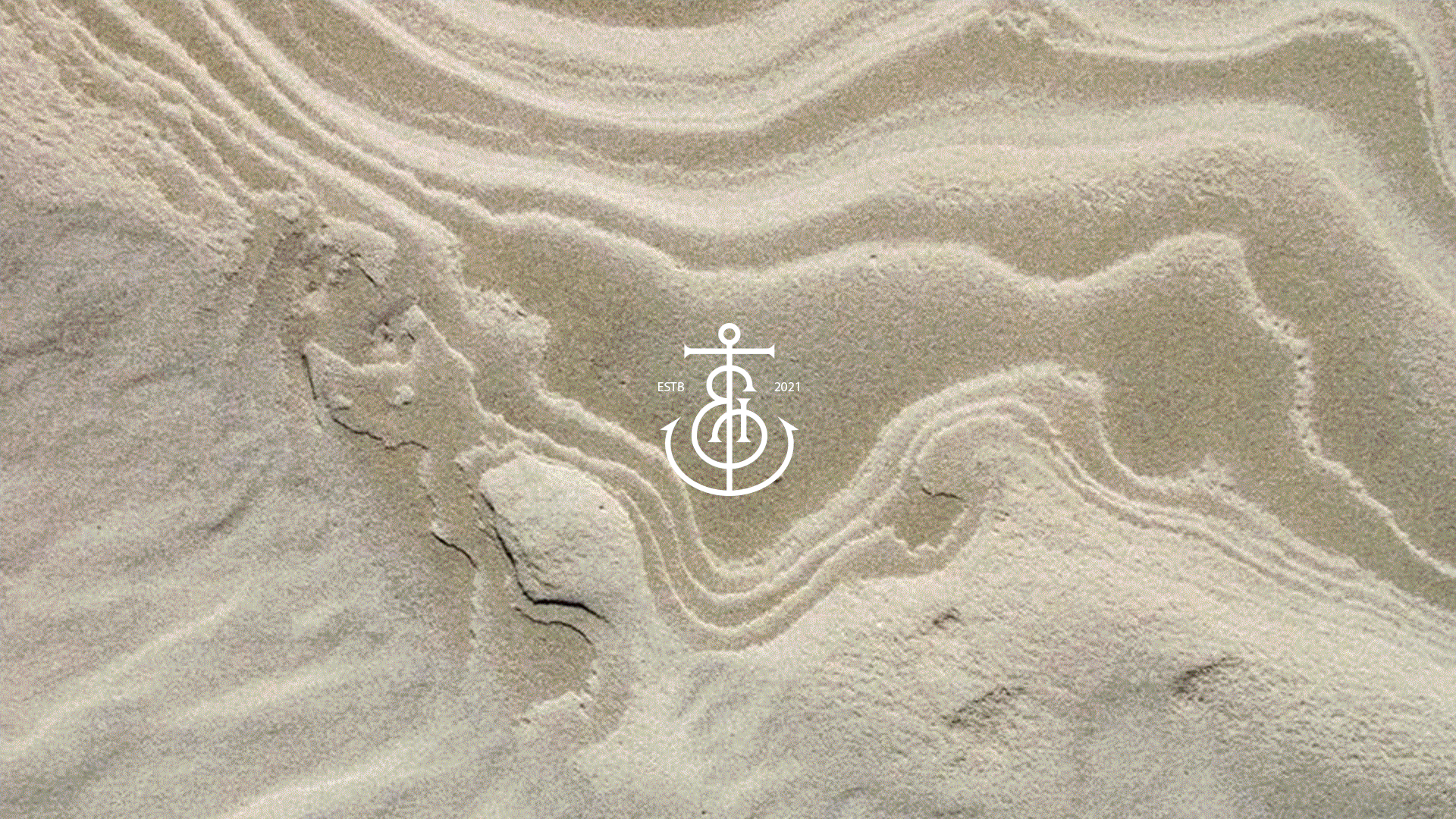
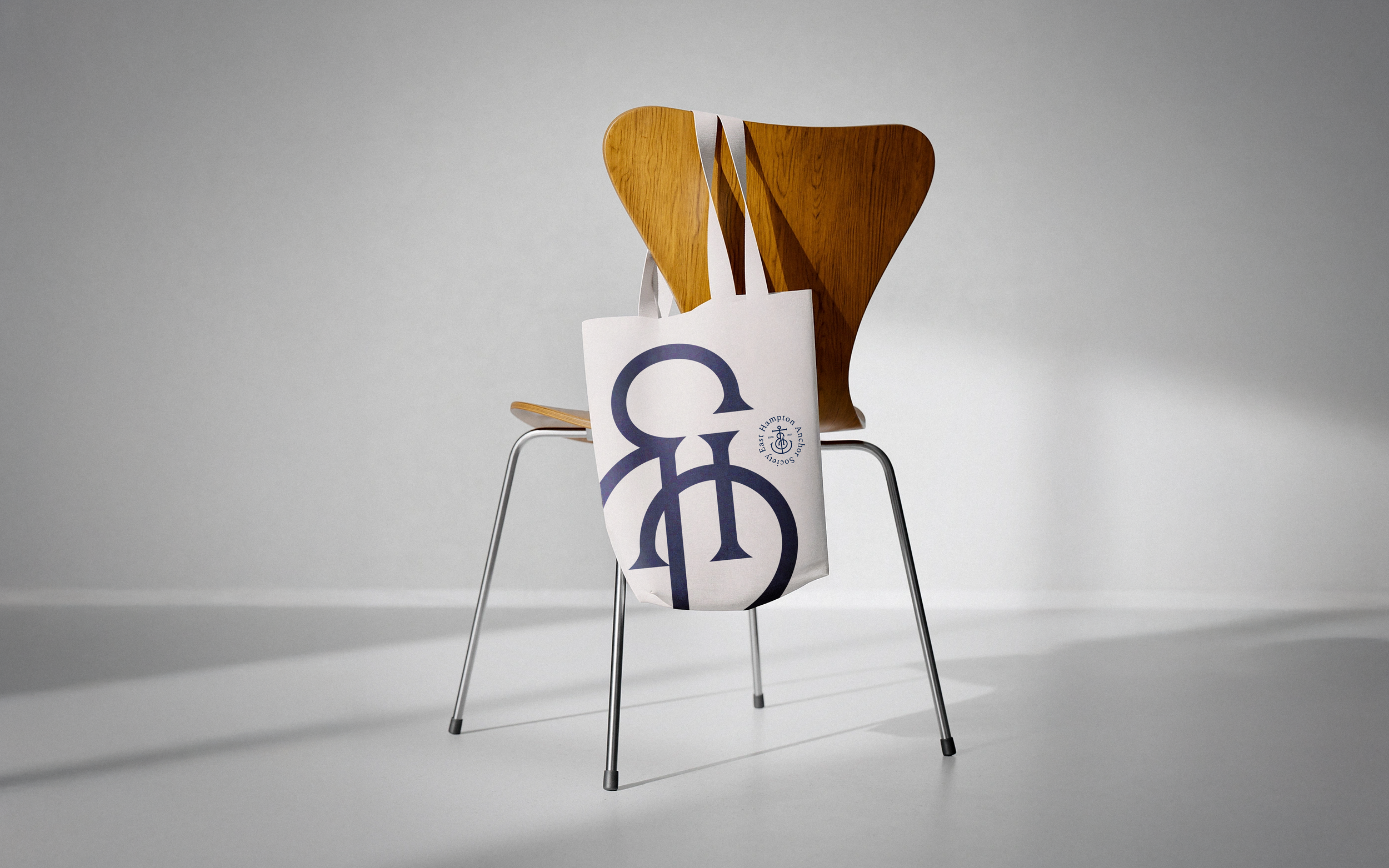
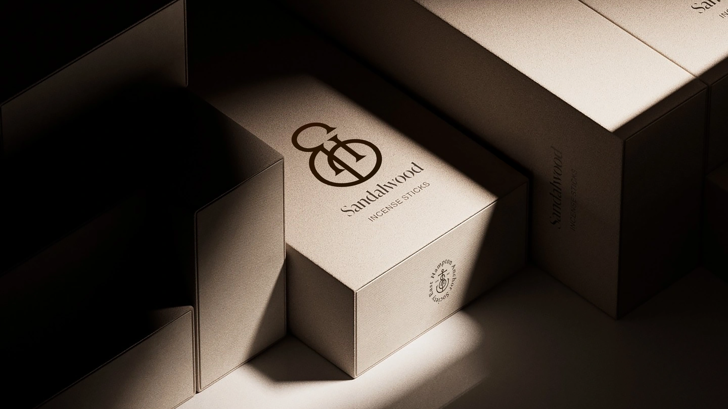
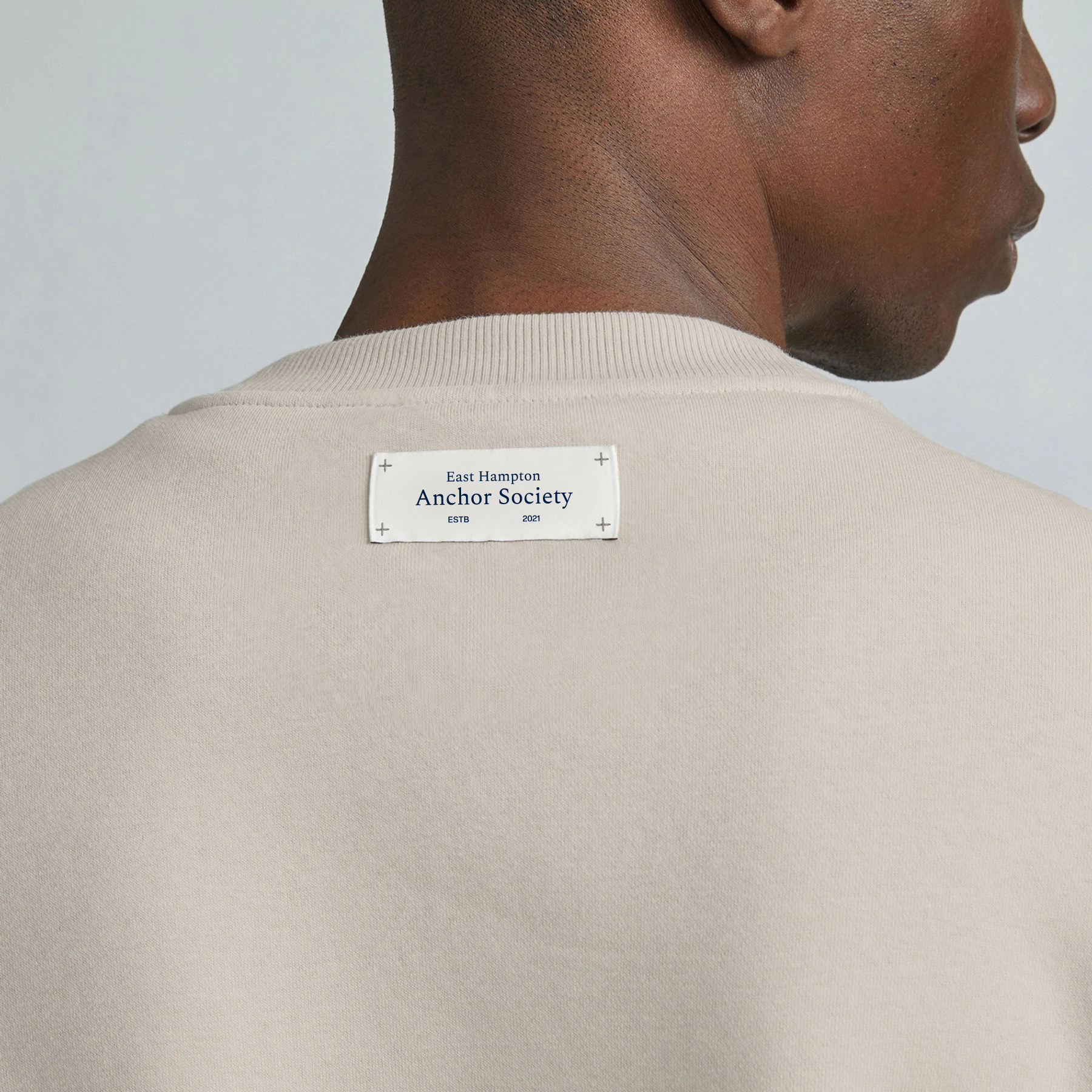
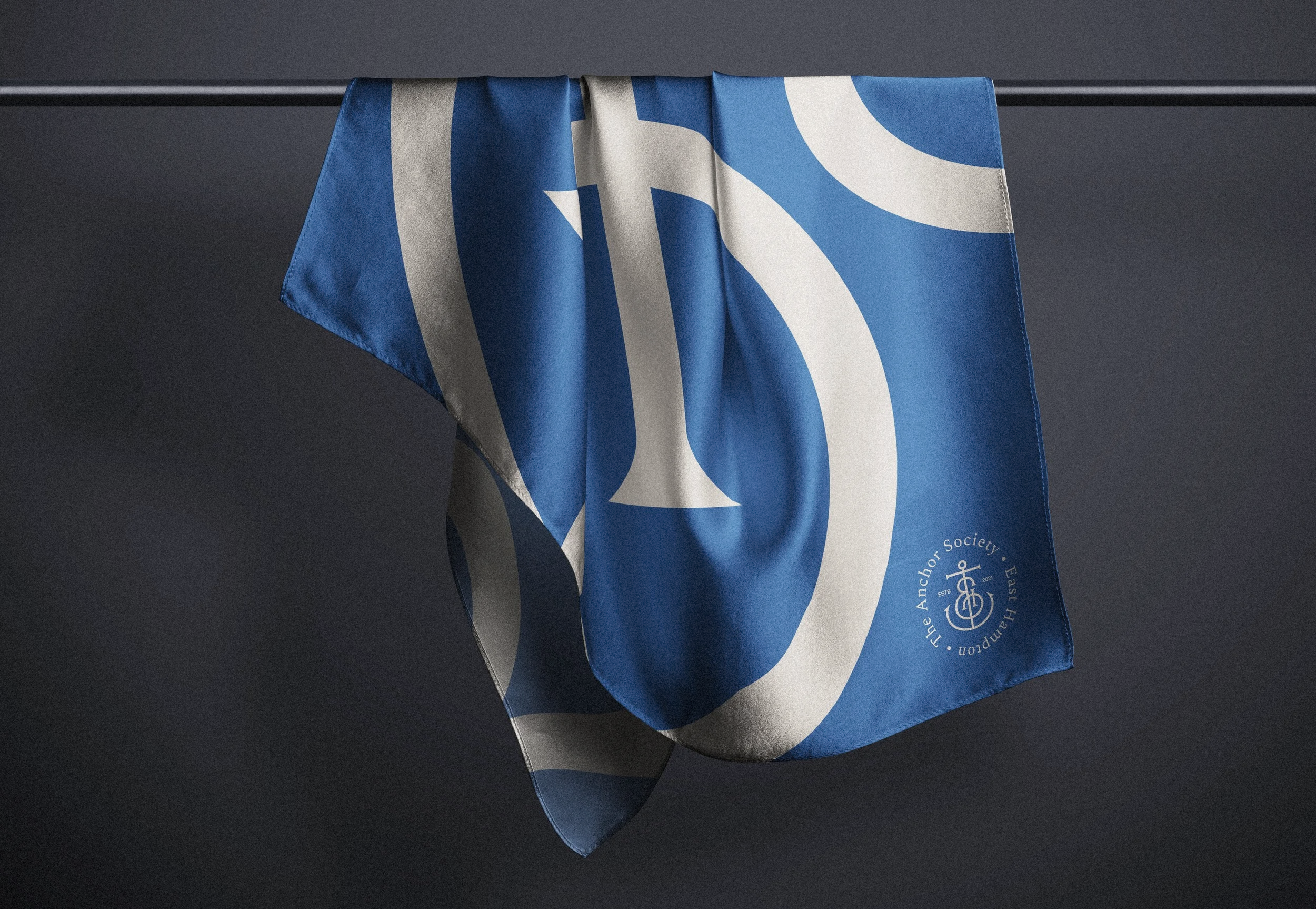
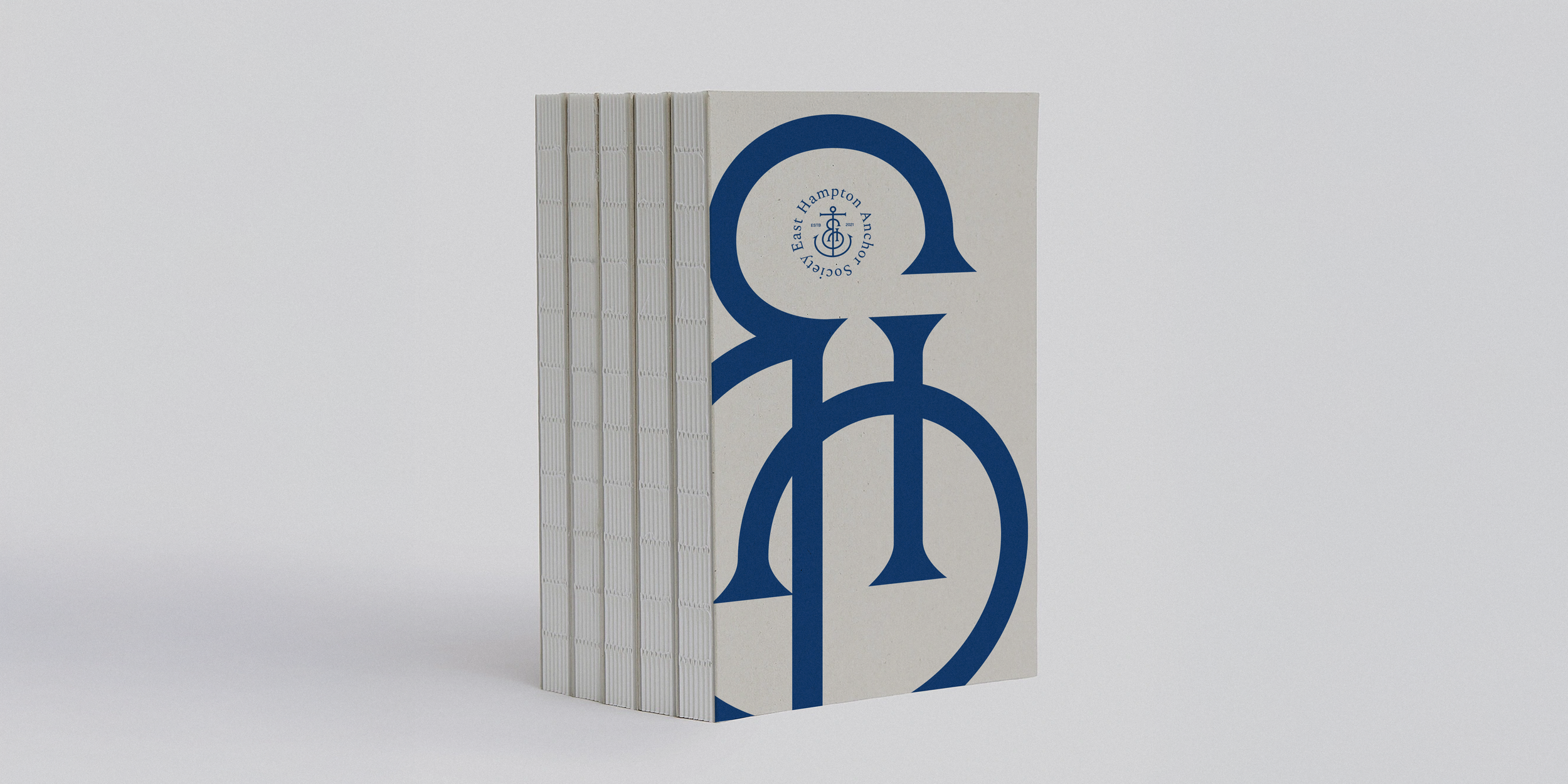
THE ANCHOR SOCIETY
Design Direction / Art Direction
The East Hampton Anchor Society is a nonprofit that enriches village life beyond the summer season. By activating underused spaces during quieter months, they transform idle areas into hubs of culture, connection, and community — extending even into a dedicated shop that serves as a gathering point.
We reimagined their design system to reflect that same spirit: confident, refined, and unmistakably their own. The system was crafted to resonate with year-round residents and the benefactors who sustain their mission.


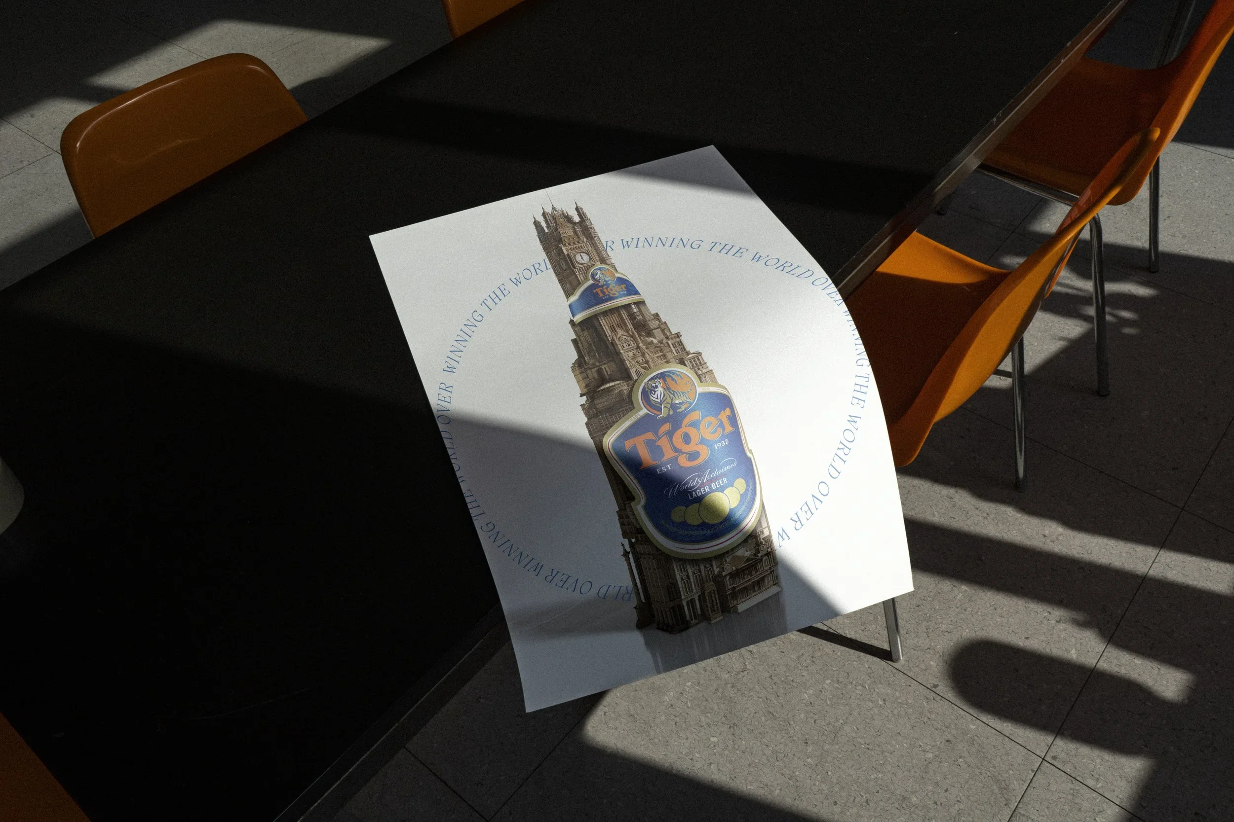
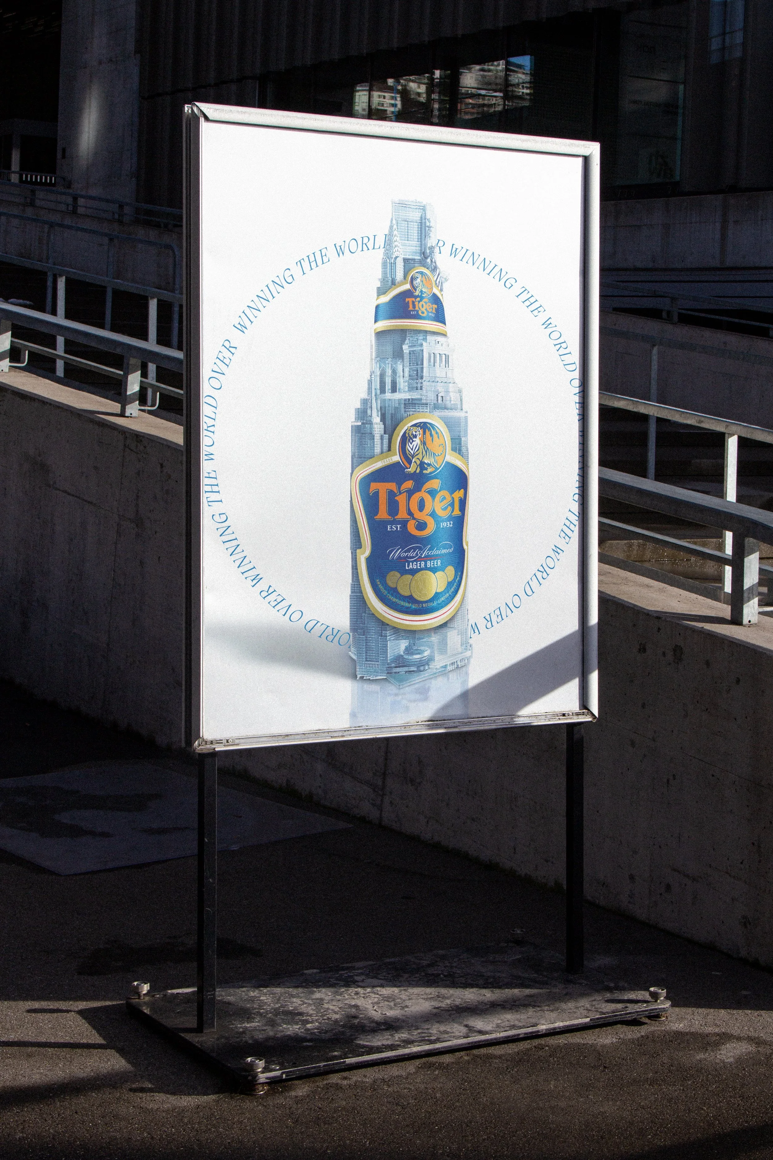
TIGER BEER
”WINNING THE WORLD OVER”
Creative Direction / Design Direction
Tiger Beer wanted a visual that conveyed its global presence in cities like London, Paris, and New York. We created a bold, imaginative image: a Tiger Beer bottle constructed from iconic landmarks of each city. The artwork became a striking symbol of the brand’s global reach, cultural relevance, and dynamic urban energy, embodying Tiger Beer as a bold, world-embracing brand.


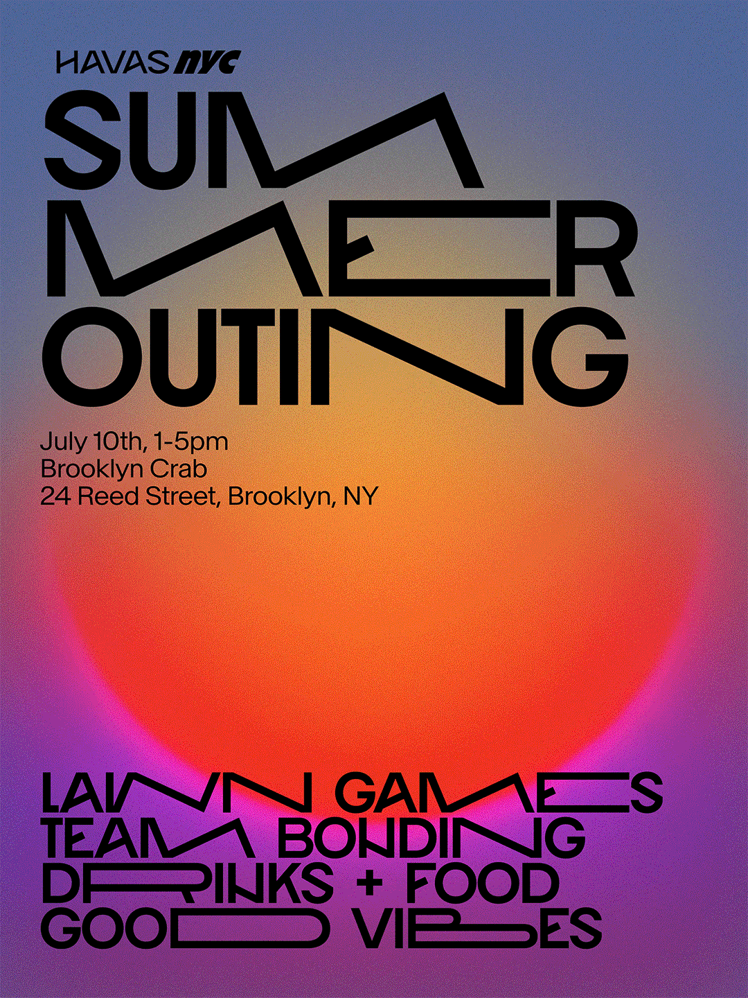
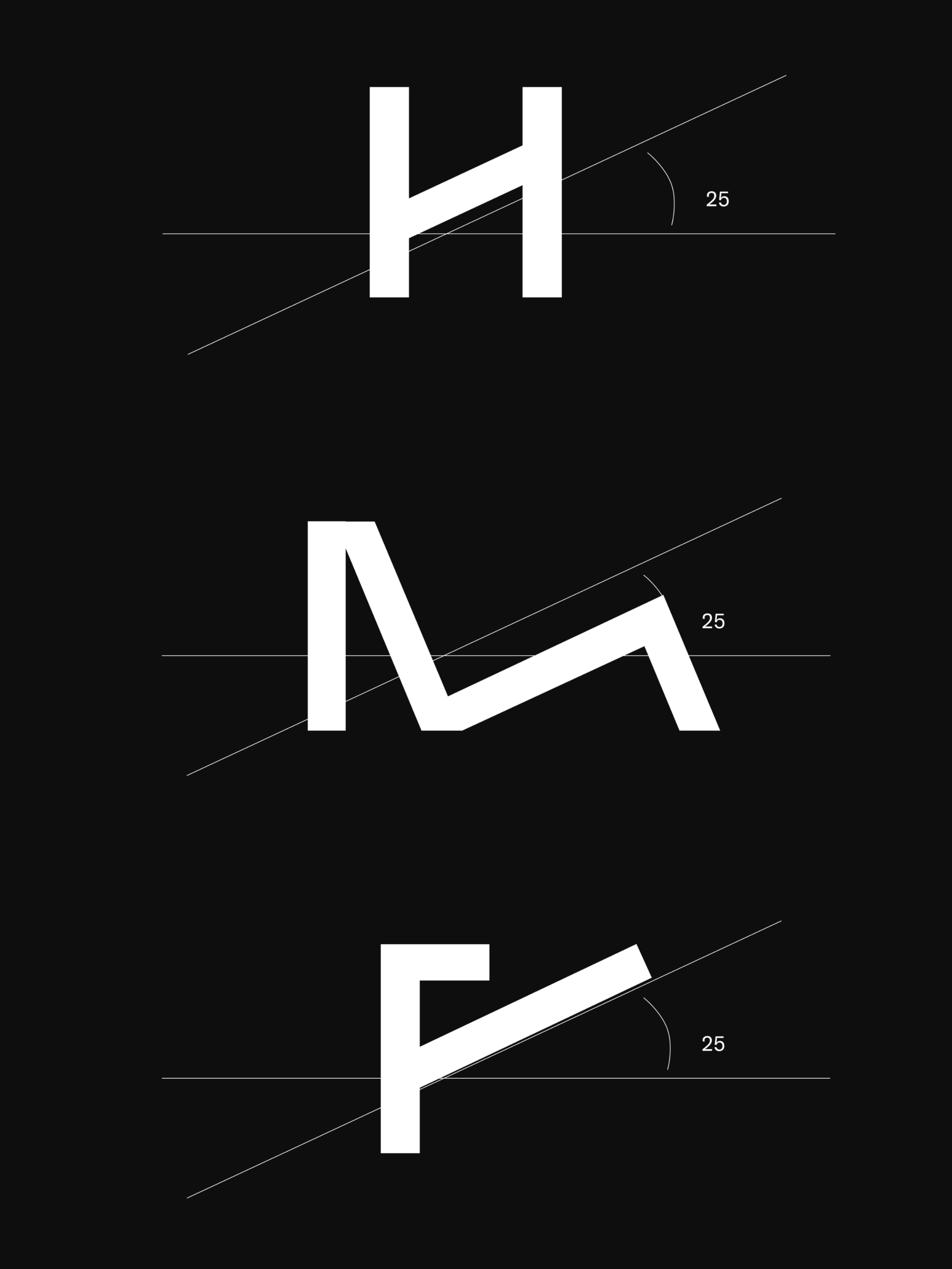
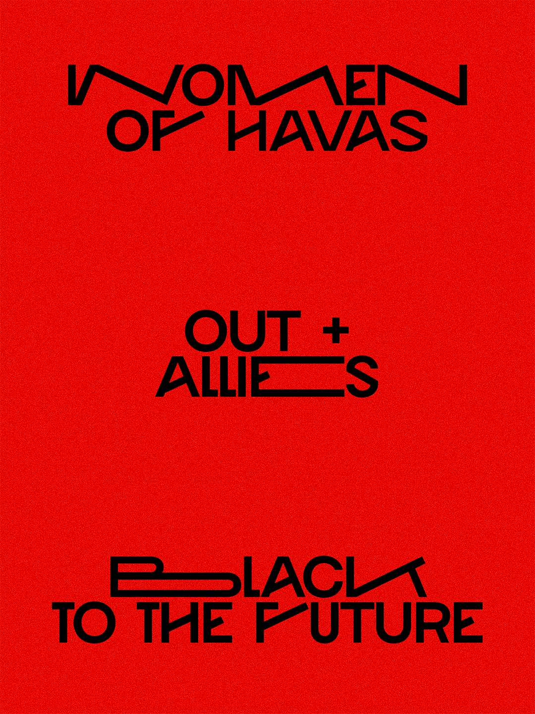
HAVAS NYC
”HAVAS NYC SANS”
Creative Direction / Design Direction
Credit: Natasha Mozz, Typographer
For internal use at Havas New York, we designed a custom typeface inspired by the sharp, angular geometry of the Havas logo. The letterforms reflect the rhythm of New York’s grid, energetic, unpredictable, and always in motion. The result is a font that feels confidently modern, with just enough edge to keep it distinctive and engaging across internal communications.
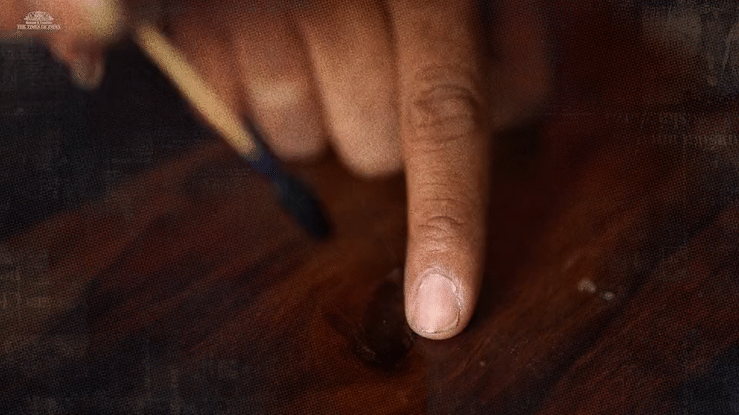
THE TIMES OF INDIA
”THE INK OF DEMOCRACY”
Design Direction / Art Direction
In the 2019 Indian General Elections, one-third of eligible voters didn’t show up, 300 million people driven by apathy, disillusionment, or a lack of urgency. For the 2024 elections, we aimed to turn inaction into a powerful call to vote.
In India, every voter receives indelible ink as a mark of democratic participation. In 2019, 7,500 litres of that ink went unused. We repurposed it to print full pages of The Times of India and The Economic Times during the 2024 elections. Just the ink left by 132 absent voters could print a single page. In total, 2.28 million pages carried not just the news, but the message: your vote leaves a mark.
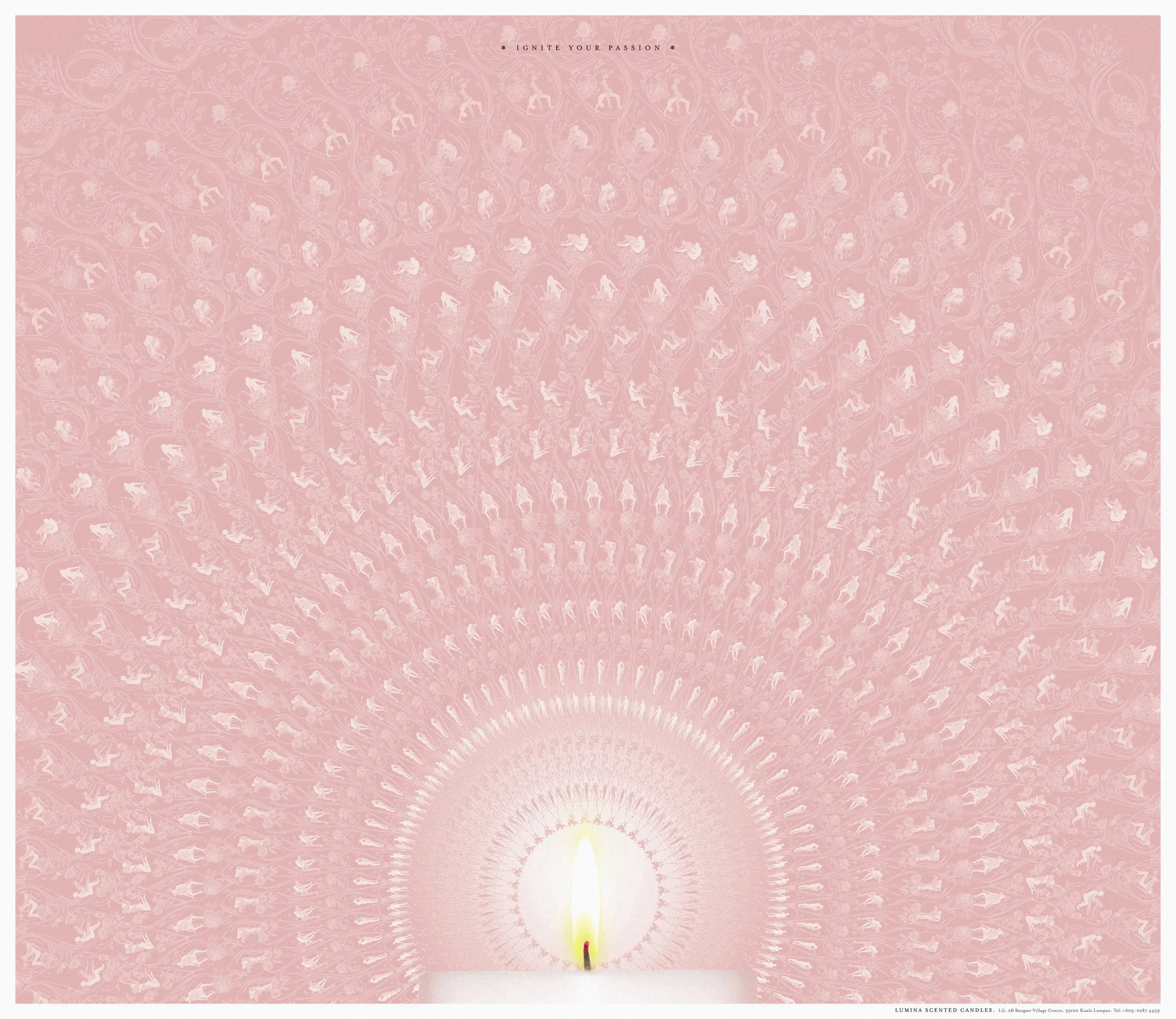
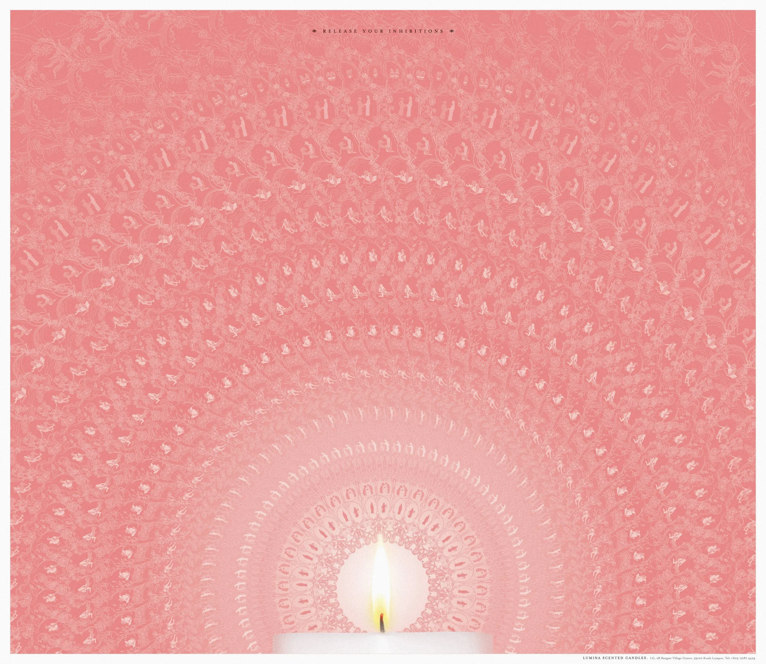
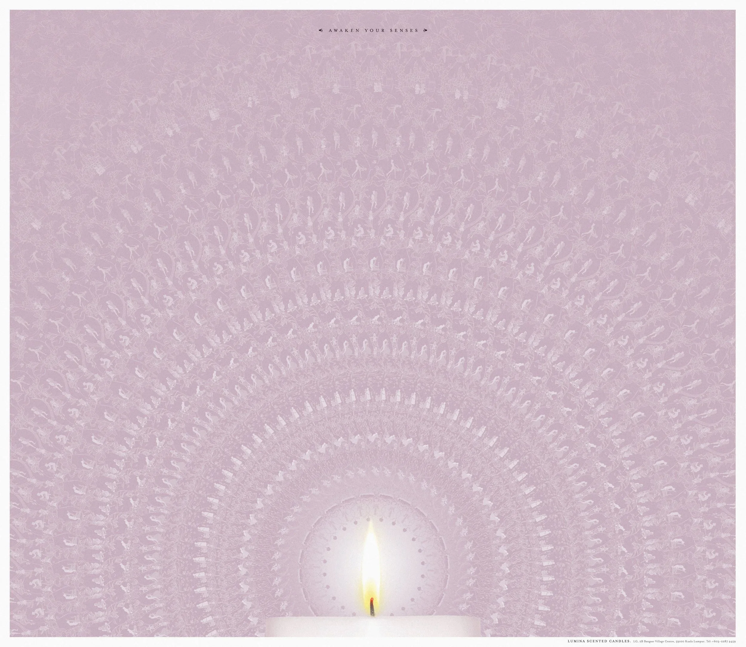
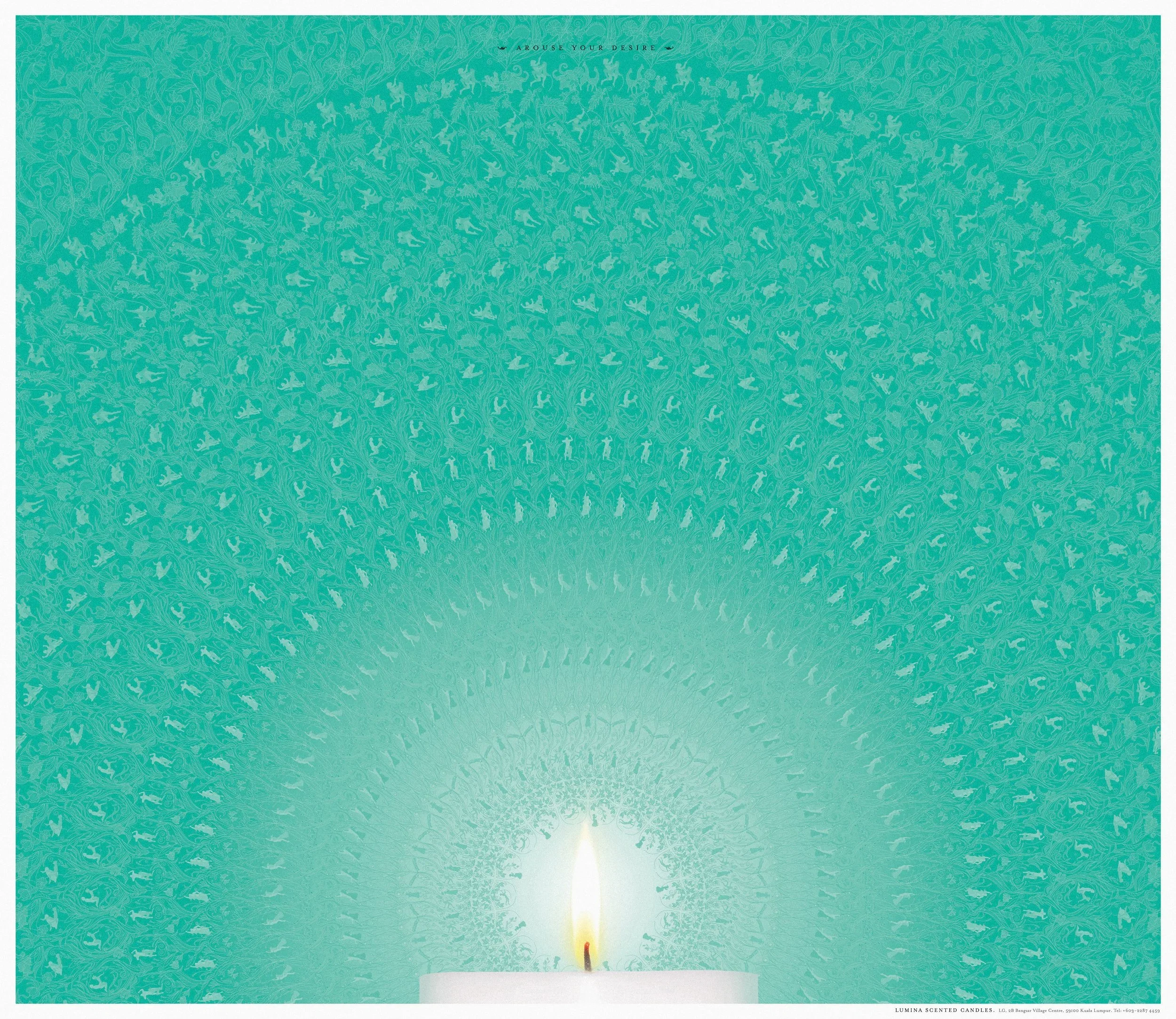
LUMINA
”RADIANT”
Creative Direction / Design Direction
This concept explored the chemistry between scent and emotion, using the layered glow of a candle as a visual metaphor for desire unfolding. Each layer radiates outward, mirroring how scent travels: subtle at first, then undeniable, awakening something instinctual and wild. The system balances softness with heat, restraint with release, elegance fused with erotic energy. Months of meticulous research 😈 brought the concept to life, every detail crafted to resonate.

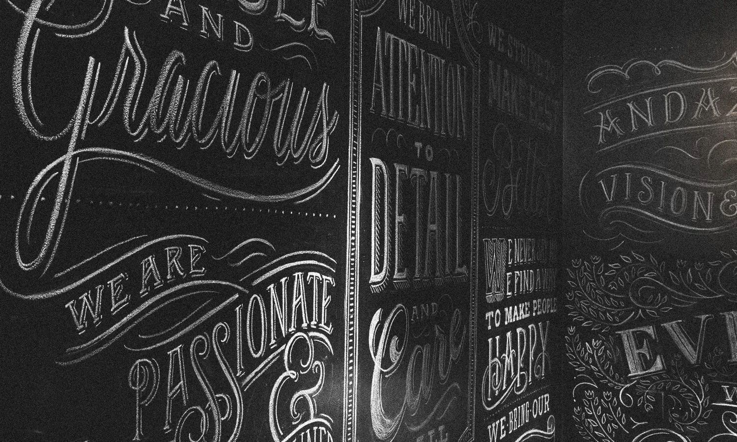
ANDAZ HOTELS
”THE ANDAZ CODE”
Creative Direction / Design Direction
What began as a request for employee recognition posters became something immersive. We transformed a stairwell into a speakeasy-style entrance, turning a routine space into a moment of surprise and celebration.
The concept energized hotel culture and was adopted by other Andaz locations worldwide. Along the way, it earned several creative awards, proof that a small idea, well executed, can have a big impact.